This ID lets you retrieve or verify your consent settings. It stays saved for {0} months or until you clear cookies — keep a copy in case you need to reference it.
AMC89MQ329407NSADRFA09MA7SD
Required
Essential Consent
Off
On
Marketing Consent
Off
On
Analytics Consent
Off
On
Personalization Consent
Properly uses cookies and similar technologies to improve your experience, analyze traffic, and to show you relevant content and advertising.
You can accept all, reject all, or customize your privacy settings.
In our view, DeFi doesn’t have a data problem as much as a guidance problem. With too much information, you can't really tell what the most important metrics are, what the product's risks are, or how to pick the best yield for your needs.
With Silo, that meant rebuilding the whole thing from scratch, not just reskinning what was there. Here's how we did it.
From Research to Blueprint
Before any design started, we had to understand what we were actually fixing.
We began with collaborative workshops alongside the Silo team, followed by a full UX audit, going screen by screen. The app was built around protocol logic, not user intent, and the audit proved it: information duplicated across tabs, no hierarchy on the cards, user positions barely visible, no way to see earnings at a glance.
From there, we mapped everything: every feature, every flow, every state. Then user flows for all the main cases, first-time lender, experienced borrower, someone managing an existing position, someone checking risk exposure. Each one grounded in what we heard in the workshops and found in the audit.
The last step before we opened Figma: prioritization. Not everything could ship in the first version, and pretending otherwise would have killed the project. We agreed on what goes now and what comes later, which kept the team focused and the scope honest.
Mapping Who Uses the App
Two main user types came out of the research. The product was already live, so we had real behavior to work with, not just assumptions.
Lenders
Range from retail users depositing a few hundred to liquid funds moving millions. What mattered most to lenders, in order, was spot APR, 7-day APR, risk scoring, and clarity around exposure, particularly how isolated or aggregated risks affect deposited capital. They need help making decisions, not just data.
"What risk am I taking when I lend?" / "Why should I trust Silo? Is there any bad debt in the market?" / "I find the UI overwhelming."
Borrowers
High risk takers using collateral for leverage. They understand the mechanics but hate the uncertainty.
"I don't borrow because it is too risky" / "Rates spike without warning, I can't tell if it's temporary" / "Dashboard is too long and packed"
One thing came up consistently across both groups: people hate liquidation risk. That shaped a lot of what came next.
The design challenge: serve experienced borrowers who actively manage positions and passive lenders who just want to deposit and earn, in the same interface.
Two Vaults for Two Mindsets
Instead of forcing everyone through the same flow, we designed two vault types with different exposure.
Multiple Asset Vault
The simpler entry point, designed for passive lenders. Multi-Asset Vaults aggregate exposure across multiple isolated Single Asset Vault markets, routing deposits across underlying lending opportunities and abstracting active position management for the user.
Returns are generated from this diversified allocation, but so is risk exposure: users are exposed to the performance and risk characteristics of multiple isolated markets simultaneously, rather than a single market pair. The tradeoff is convenience and diversification in exchange for broader exposure across underlying vaults.
Single Asset Vault
A Single Asset Vault is an isolated market built around a specific collateral and borrow pair. Risk is contained at the vault level: liabilities, collateralization, liquidations, and bad debt remain isolated to that market rather than propagating across the broader protocol. For users, this creates a more configurable environment, but also a more explicit responsibility to understand the specific risks of that isolated pair.
Users can configure positions directly - switch assets, toggle between earning and borrowing, inspect utilization, collateral requirements, liquidation thresholds, and understand precisely how risk behaves inside that isolated vault. The old design had two identical tiles for each vault. We replaced it with one screen that adapts to what you need.
Naming as Product Design
Before touching any UI, we had to fix the language.
The old naming worked against users at every turn. "Lend" is a banking term. Users think about earning, not lending mechanics. "Dashboard" implies a control panel, not ownership. The markets page framed Silo like a generic lending protocol when it's anything but. So we simplified:
Lend became Earn
Dashboard became Portfolio
The markets page was removed entirely, the information was already covered elsewhere
Each vault became one product card with its type and configuration built in
The vault naming took more work. The old cards had no language to distinguish between them beyond asset names. We needed a way to communicate what you're actually taking on, at a glance. WWe landed on Single Asset Vault and Multi-Asset Vault because the distinction communicates the primary thing users need to understand: not yield differences, but differences in risk architecture and exposure. In DeFi, exposure is the real differentiator. Everyone has APY. Not everyone makes risk this legible.
We also added Explore, a discovery page that didn't exist before. The old app put you straight into a list with no way to find what's relevant.
Naming is product design. Get the language right and half the confusion disappears before anyone touches the UI.
Making Risk Readable
For Lenders
Research showed us what lenders care about most, in order: spot APR, 7-day APR, risk score, how much they’re exposed, and whether that exposure is isolated to a single market or diversified across multiple underlying markets. So the design had one job: put that information front and center, in that order.
The Explore page leads with the best opportunities available right now. Inside each vault, the layout follows the same logic, starting with your position and yield, then drilling into the details if you want them. Want to understand what you're getting into before committing? It's one tap away, not buried five screens deep.
Yield also comes from more sources than most users expect. Besides interest paid by borrowers, lenders may earn from multiple sources, including borrower interest, ecosystem incentives, and liquidation-related revenue where applicable, a cut from positions that get liquidated in the market. That last one raises eyebrows when you first explain it, but it's real yield and hiding it would have been dishonest. We made a point of showing all three, clearly labeled.
For Borrowers
Borrowers think differently. They're actively taking on leverage, and the thing they fear most is getting caught off guard.
So the health factor is always visible, not tucked into a details panel. Liquidation thresholds, collateral ratios, and the mechanics of isolated vault liquidations are explained in plain terms, not just shown as a number. The interface shows what's happening to your position right now, and what would need to change for it to become dangerous.
The Configurator Pattern
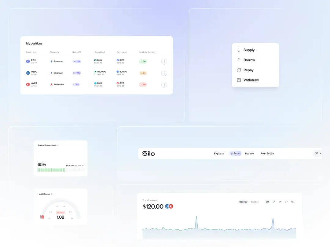
The old design had a fundamental structural problem. Every vault appeared as multiple separate tiles, one for deposits, one for loans, even though they were the same product with different modes. Users had to navigate between pages to do things that logically belonged together.
The fix wasn't just visual. It required rethinking how users interact with an isolated lending market: one product with multiple modes, not multiple products. That insight led to the configurator, a single component that adapts based on what you're trying to do.
Inside a vault, you can switch between assets, toggle between earn and borrow, and enable repay or withdraw, all without leaving the page. It scales from a simple deposit to a complex leveraged position, one screen handling every use case.
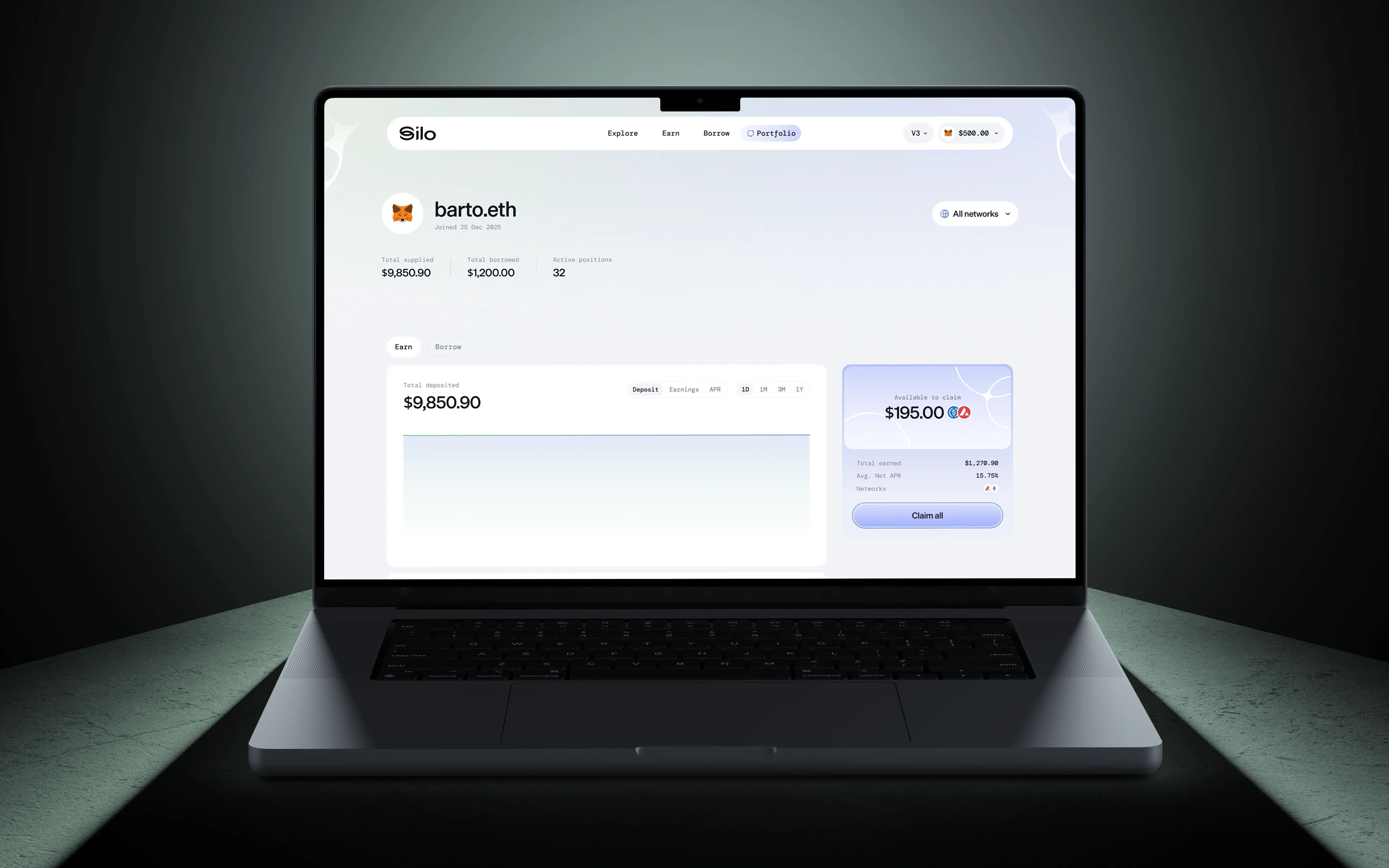
Portfolio: The Missing Piece
The old dashboard had almost nothing, just a place to collect rewards and a rough overview of what you held. No real picture of what you owned, what you'd earned, or what you were actually in.
We built the Portfolio from scratch. The UI has a clear split: one side covers everything tied to what you have open on Silo, the other shows your available assets and spendable balance, the money sitting ready to deposit, put to work, or use as collateral, including understanding how those assets interact with isolated vault positions already open.
For anyone actively juggling multiple markets, this is table stakes. For Silo, it was completely new, and essential for an app offering this many ways to earn and borrow.
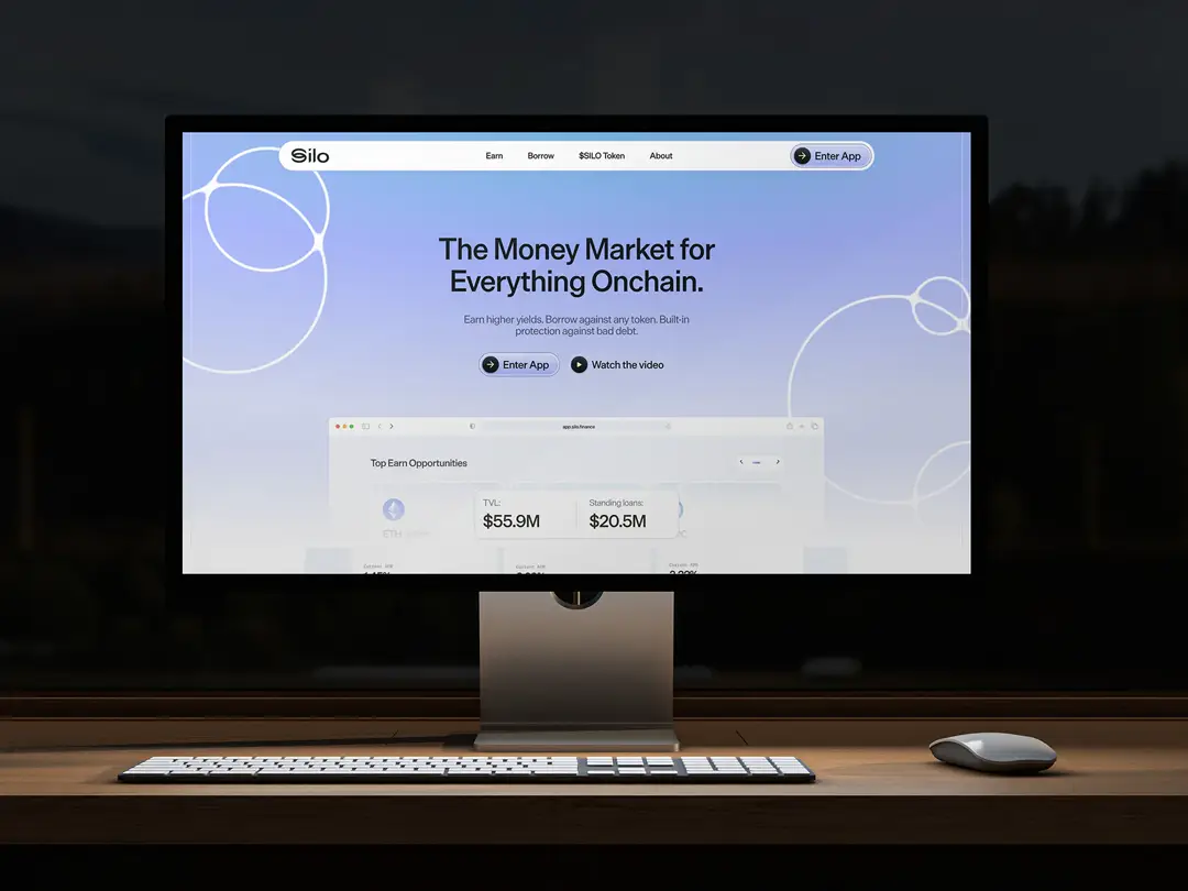
Explore: Discovery Done Right
Most apps throw you straight into a list of assets and wish you luck. Explore is designed differently, as a place where you land, get your bearings, and find what's relevant without digging.
The page leads with new vault listings so you can see what's just been added. Protocol stats sit front and center: total supplied, total borrowed, utilization rate. Then top earn and borrow opportunities, curated and ranked.
The same thinking carries into both pages. Top picks first, then everything else. Single Asset and Multi-Asset Vaults clearly separated, with distinctions surfaced around isolation, exposure type, and risk profile. Better filters and sorting, because when there are dozens of options to compare, clarity is the whole point..
What We Shipped
The scope covered the full product design process, from early research to shipped screens. Workshops and a UX audit first, then mapping every feature and flow, prioritizing what goes now and what comes later. From there, wireframes for the entire app, then the UI built around the configurator.
On top of that, three pieces that didn't exist before: the Explore page for discovery, the Portfolio for tracking what you have open, and a completely new approach to presenting vaults through the lens of risk architecture, isolated exposure, and configurable market interactions.
Branding, website, and explainer video were part of the scope too. But the app is where most of the work happened, and where everything we learned about users, language, and clarity actually came to life.
The designs tell the rest of the story. {{case-study}}


