This ID lets you retrieve or verify your consent settings. It stays saved for {0} months or until you clear cookies — keep a copy in case you need to reference it.
AMC89MQ329407NSADRFA09MA7SD
Required
Essential Consent
Off
On
Marketing Consent
Off
On
Analytics Consent
Off
On
Personalization Consent
Properly uses cookies and similar technologies to improve your experience, analyze traffic, and to show you relevant content and advertising.
You can accept all, reject all, or customize your privacy settings.
One savings account evolved into multiple stablecoins, risk categories, and yield sources. Let's walk through each version and the design choices that made it work.
Spark is part of the Sky Ecosystem, one of DeFi's largest and most established protocols. It offers savings vaults, lending markets, and liquidity solutions across the ecosystem. We've designed their entire product suite, but here we're focusing on Savings, the journey from a single account to over $9.2B in deposits across multiple risk tiers.
Spark consistently ranks in the top 5 DeFi protocols by Total Value Locked, competing with giants like Aave and Lido. The Savings product alone manages billions in user deposits across multiple stablecoins, serving thousands of users, from crypto newcomers to institutions moving seven-figure positions daily.
How it started
When Spark launched their savings product, our design was intentionally minimal: one savings account, one type of statistics, and nothing more. Today, it supports multiple stablecoins, high-yield opportunities, risk categories, transparent yield sources, and an integrated points system - all while remaining just as simple to use.
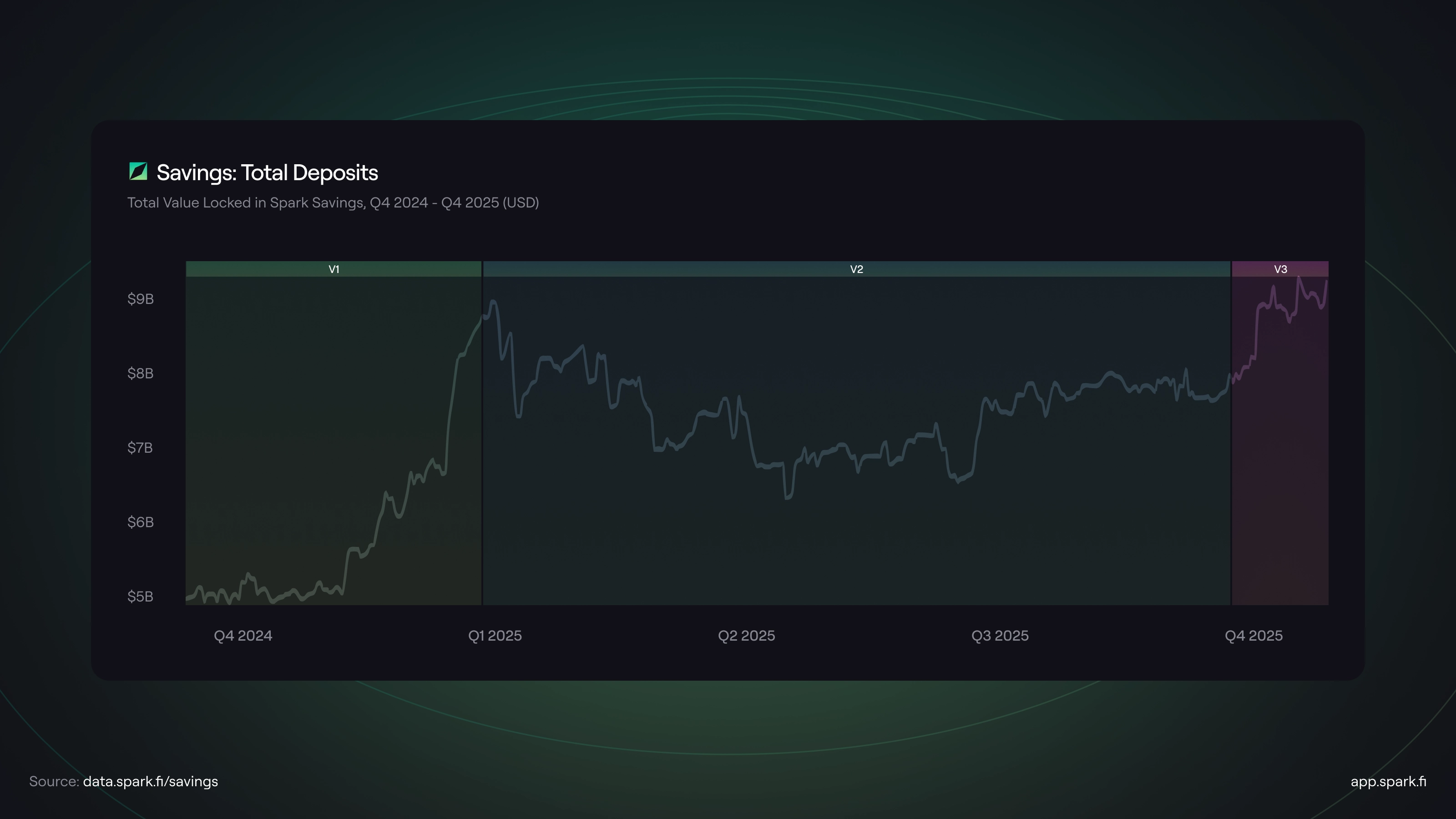
The journey visualized: each product version (V1, V2, V3) marked on the timeline, showing how design decisions impacted growth. From $5B to over $9B in deposits.
The challenge wasn't just adding features. It was creating a system that could scale to support different asset types and products while keeping the experience intuitive for both newcomers and power users. Let's walk through how we did it, version by version.
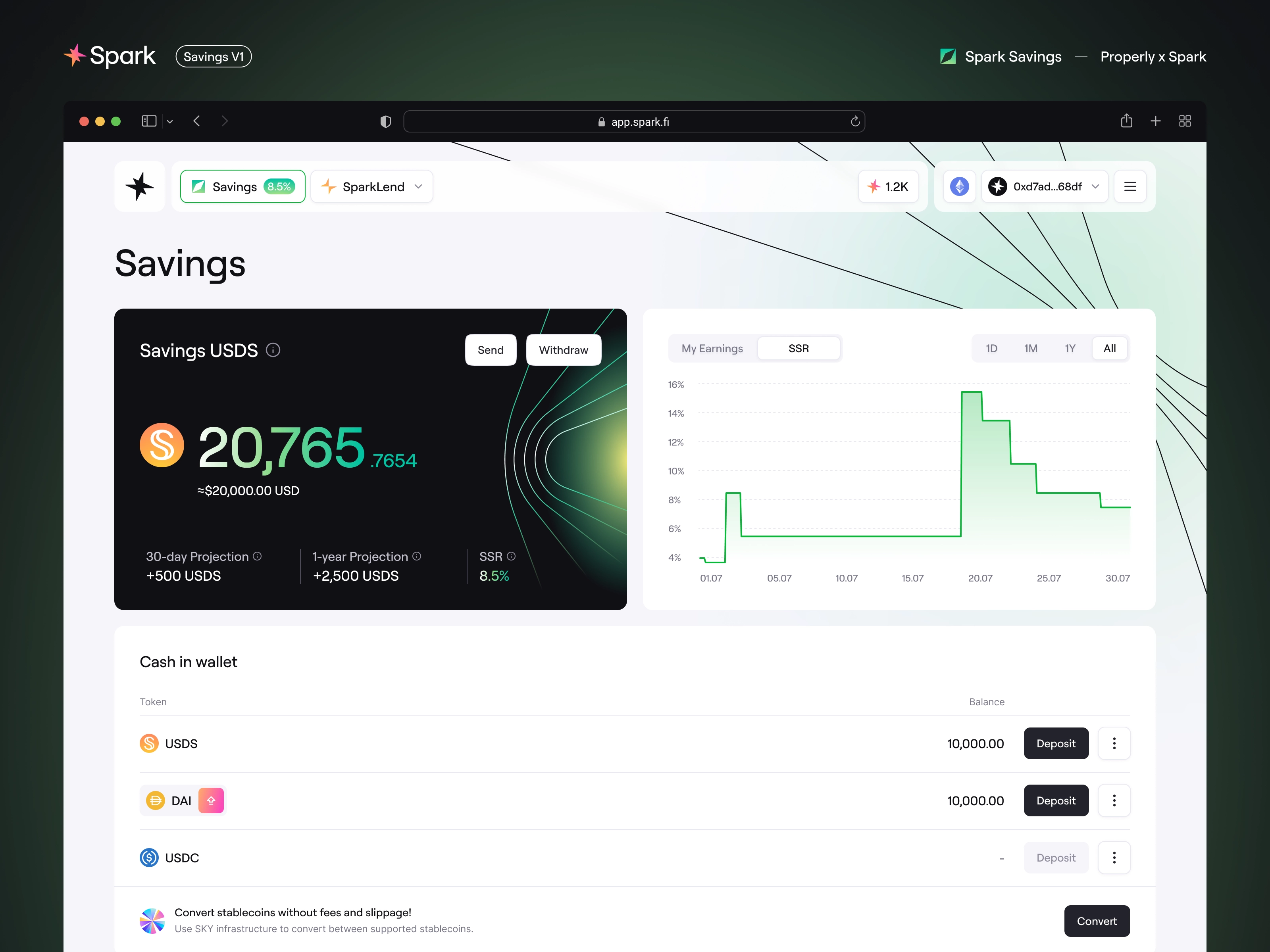
V1: The Foundation - Keep It Simple
V1 kept it dead simple: one big number showing your balance, earnings projections you could actually understand, and two buttons - Send and Withdraw. That's it.
The first version focused entirely on the core loop: see your savings rate, deposit your stablecoins, track your balance growth, withdraw when needed. Before adding more options, we needed to prove the fundamental experience worked. Users needed to trust the product before we could introduce additional options.
V1 taught us what information actually mattered. Users didn't need dozens of charts and metrics - they needed confidence that their money was safe and growing predictably. Everything else was just a noise at this point.
V2: Adding Capacity - Three Accounts, New Structure
For Spark, not all stablecoins are the same. Each one - USDC, USDS, DAI - has different characteristics and yields, which meant each needed its own dedicated savings account. The single-account interface had to evolve into a scalable system that could present multiple stablecoins clearly.
What changed:
Adaptive card-based layout - default state invites deposits, deposited state focuses on your balance and earnings
Enhanced statistics - clearer "My earnings" and "APY" view, with added global metrics (TVL, users, liquidity)
Educational content - brief vault descriptions for context, with links to detailed documentation
Visual hierarchy - USDC clearly positioned as the primary option
The key was making sure users understood they weren't choosing between equal options. USDC was the recommendation. The other accounts were there if you needed them.
V3: Risk Categories - Standard vs High Yield
V3 introduced something fundamentally different: for the first time, not all savings products carry the same risk profile. The High Yield category represents different risk characteristics - staked USDS offers higher returns, but users need to understand what they're getting into. Our solution started with visual separation - High Yield lives in its own section below standard savings.
When someone deposits for the first time, they go through an onboarding flow with vault explanation, documentation, and risk acknowledgment. We added explanatory tooltips where they matter. Coverage statistics show how yields are actually generated. And clear labeling throughout makes sure users know exactly what they're choosing.
The result? Users who want higher yields can access them immediately, with full transparency. We kept asset type implicit (users can see the difference) while making risk level explicit (Standard vs High Yield).
What else is new in V3:
New Savings accounts: ETH and USDT joined the family two weeks after the high-yield vault launch, giving users more options for their standard savings
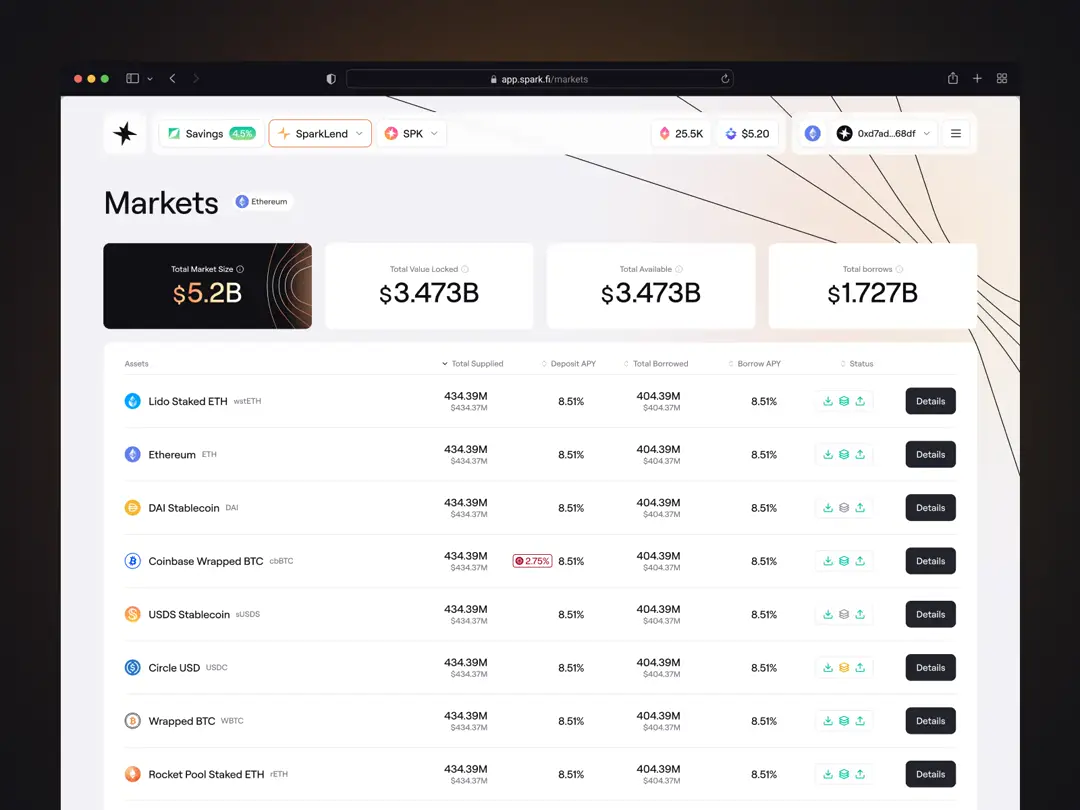
Coverage statistics: Pie chart showing how savings are backed, with detailed collateral breakdown and vault locations - transparency about where your funds actually are
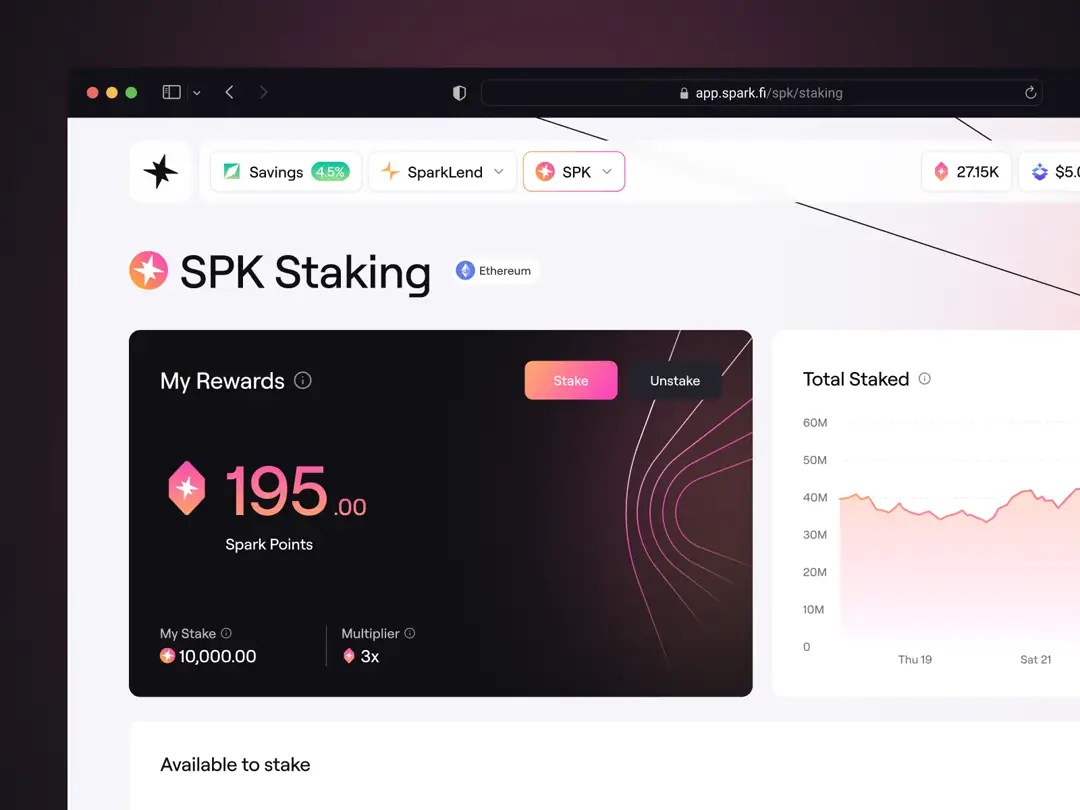
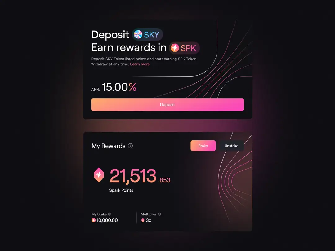
Spark Points integration: Badge on main card showing earned points, point-earning info during deposits, and earnings breakdown in dashboard showing both points and yield side by side
Legacy accounts: Older vaults being phased out due to rebranding or contract migrations. Still fully accessible to users with deposits, just moved to their own section to keep the main interface focused
{{case-study}}
Beyond Savings: The Full Spark Experience
Spark Savings is one piece of a larger ecosystem. Users who start with savings often move to SparkLend for borrowing and lending, explore different markets, and participate in the points system for ongoing rewards. Here's the thing: every product in the ecosystem faces the same challenge. Sophisticated DeFi mechanics need to work for both newcomers depositing their first hundred dollars and crypto natives managing complex multi-asset positions.
Our design system connects the entire ecosystem. Risk indicators stay consistent across products, financial data follows the same hierarchy - wherever users go, every product feels like it's from one "bank". As Spark grows and Savings keeps evolving, everything stays familiar. That's the ultimate goal of a design system.
Want to see it in action? Check out Spark Savings - everything in the interface is our design, brought to life by the Spark team.