This ID lets you retrieve or verify your consent settings. It stays saved for {0} months or until you clear cookies — keep a copy in case you need to reference it.
AMC89MQ329407NSADRFA09MA7SD
Required
Essential Consent
Off
On
Marketing Consent
Off
On
Analytics Consent
Off
On
Personalization Consent
Properly uses cookies and similar technologies to improve your experience, analyze traffic, and to show you relevant content and advertising.
You can accept all, reject all, or customize your privacy settings.
How We Designed Spark's Airdrop to Keep 94% of Tokens in the Ecosystem
In an industry where airdrops usually get sold immediately, Spark achieved 94% staking rate. Read how we designed the flow that made long-term participation feel obvious.
We've designed their entire product suite, but this case study focuses on the airdrop campaign that achieved something unusual in crypto: getting 94% of token recipients to stake instead of immediately selling.
The Challenge We Actually Faced
Spark Protocol came to us with something different. Instead of the typical "distribute tokens and hope for the best" airdrop, they had invented a two-phase campaign.The Ignition airdrop rewarded genuine DeFi participation - stablecoin holdings, lending activity across Aave and Morpho, Pendle positions, real users doing real DeFi activities.
Then came the Overdrive phase: users who staked their Ignition tokens could qualify for additional rewards from unclaimed tokens. This created a natural incentive for long-term participation rather than immediate selling. Their challenge wasn't "how do we run an airdrop without crashing our token?" They'd solved that strategically. Their question was: "How do we translate this into an interface that makes the smart choice feel obvious?"
Breaking Down the Flow
What started as a claiming interface became a behavioral design challenge. By the end, we had created a flow that turned what's typically a one-time transaction into the beginning of long-term protocol engagement.
The constraints:
Can't promise specific numbers for future rewards
Can't make staking mandatory without destroying trust
Everything needs to feel transparent, not manipulative
The opportunity:
Spark had real value to offer (Overdrive airdrop qualification)
Spark Savings could provide immediate additional benefits
Users actually benefit more from staking than selling (if they understand why)
The challenge wasn't technical. It was behavioral: answering "What am I gaining by locking my tokens?" and "Can I trust these guys?" in a way that made staking feel like the obvious choice. Our approach was simple: make staking feel like the smart choice, not the forced choice. Here's how we structured each step to answer users' core questions about value and trust.
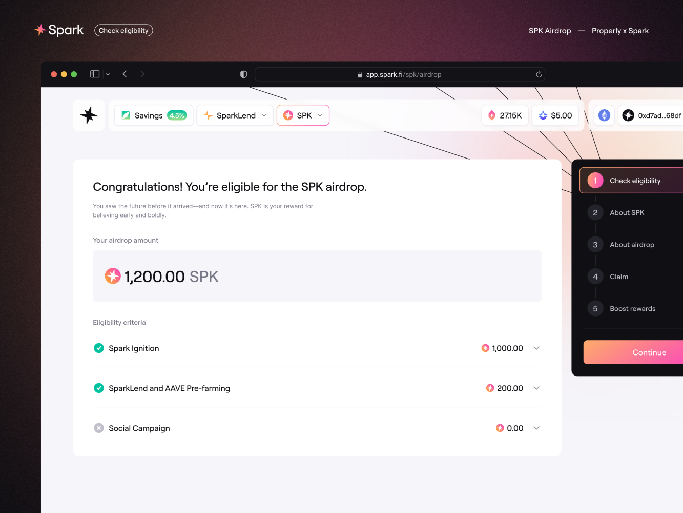
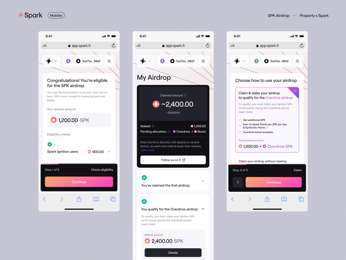
Step 1: Check Eligibility - Complete Transparency First
Users see exactly why they qualified and how much they're receiving - doubt evaporates before the decision even begins.
So we flipped it. Lead with complete transparency. Show the exact allocation. Explain why: Spark Ignition participation, campaign involvement, specific activities that qualified them. No vague "you're eligible!" without context.
The breakdown isn't just nice to have - it answers the fundamental question users ask themselves: "Is this real?" When someone sees their specific activities listed with corresponding token amounts, doubt evaporates. They're not wondering if this is legitimate. They're ready to decide what to do next.
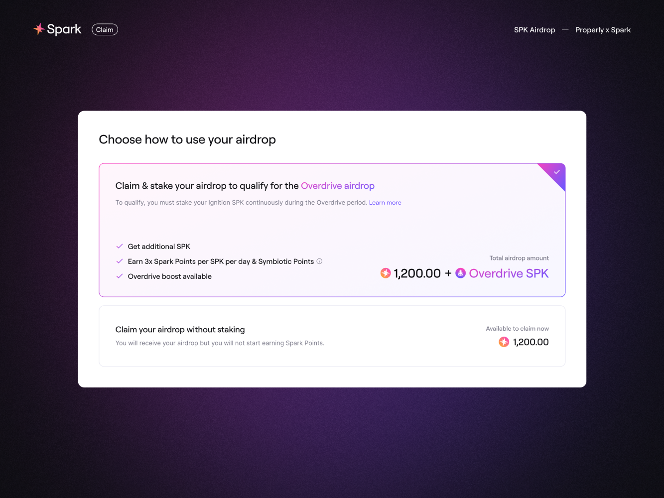
Step 2: The Decision - Claim vs Claim & Stake
"Claim & Stake" gets visual priority while "Claim" stays accessible - clear guidance without manipulation.
This is the moment. Users choose between claiming tokens or claiming and staking them. We could have made the options look equal. We didn't. Claim & Stake got visual priority, multiple benefit callouts, and positioning as the smart choice. "Claim" stayed available but felt like settling for less. The design makes staking look obvious without making claiming look hidden.
We couldn't promise specific numbers for the Overdrive airdrop because the rewards were dynamic - they depended on how many users would stake their tokens and how many would use the boost feature. We initially explored a calculator system to simulate potential returns, but with both variables unknown, it became impossible to give users reliable estimates.
That constraint actually made the solution stronger. Instead of bribing users with promises, we had to make staking genuinely appealing. Spark Points, boost opportunities, ecosystem participation - real, immediate value. The Overdrive qualification became the bonus, not the only reason to stake. The nudge is clear, but the choice is honest. Users who want to claim and leave can do exactly that. We just made sure everyone understood which option actually serves their interests better.
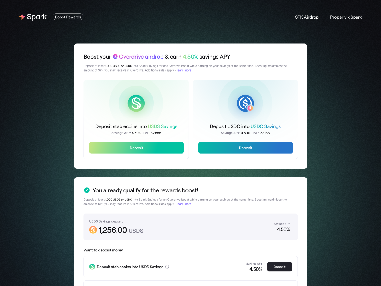
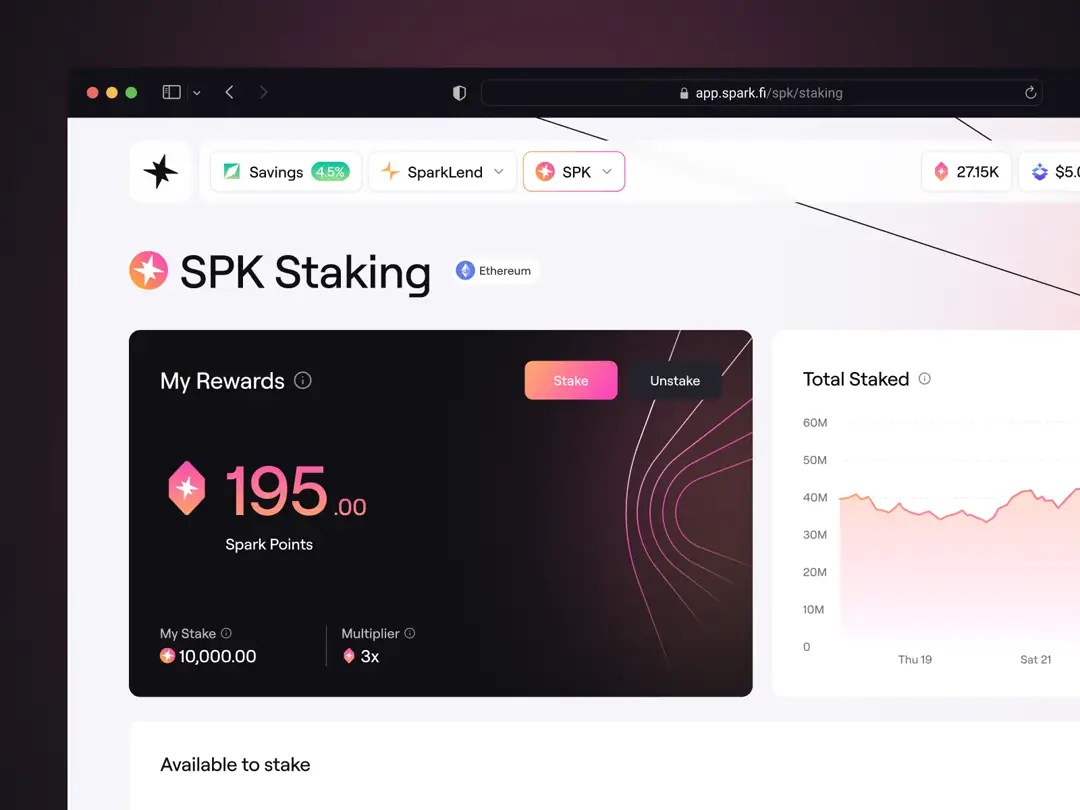
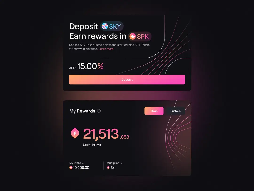
Step 3: Boost Rewards - Keep the Momentum Going
Dual benefits (Overdrive boost + 4.50% APY) appear at the perfect moment when users are already thinking long-term.
For users who chose staking, we introduced another opportunity: boosting their allocation through Spark Savings products. These users are already thinking long-term. They chose ecosystem participation over immediate exit - the momentum was already there, we just needed to channel it.
This step serves multiple purposes:
Immediate value: Enhanced airdrop allocation
Product adoption: Natural introduction to Spark's other offerings
Ecosystem lock-in: More products used means higher switching costs
The key was making this feel like natural progression, not a separate sales pitch. They're in the right mindset for deeper engagement. We highlighted both the allocation boost and the fixed yield from Spark Savings. Dual benefits make the decision easier. You're not just increasing your airdrop - you're also parking stablecoins somewhere they'll earn competitive yield.
If users already have qualifying deposits, we show that immediately: "You already qualify for the rewards boost!" No extra work needed. Want to boost more? The option is right there.
Step 4: Dashboard - Closing the Loop
Status overview, qualification tracking, and boost opportunities keep users returning instead of staking and forgetting.
We didn't want users to stake and forget. The dashboard keeps them connected. Status overview, qualification tracking, action opportunities if they want to boost later. Designed like achievements rather than administrative panels. This transforms a one-time airdrop claim into an ongoing relationship with the protocol. Users return to check progress, take additional actions, stay engaged with the ecosystem.
Mobile Was Critical
Progressive disclosure, proper touch targets, and persistent token amounts made mobile feel just as trustworthy as desktop.
We all have that instinct - when something's important, we reach for our laptop. Mobile feels like it's for quick stuff, not serious decisions about thousands of dollars in tokens. But here's the reality: a huge portion of Web3 users live on mobile. They're checking prices on their phones, managing wallets on their phones, and yes, claiming airdrops on their phones. We couldn't let the mobile experience feel like a compromised version of the "real" desktop interface.
Our mobile approach:
Information appears when you need it, not all at once
Touch targets sized for actual human thumbs
Single clear action per screen to avoid decision paralysis
Token amounts always visible so you never lose track of what's at stake
The goal was simple: make mobile feel just as trustworthy and complete as desktop. No one should feel like they need to "do this properly on a computer later" when they're already looking at their allocation on their phone.
{{case-study}}
Beyond the Airdrop: The Full Spark Experience
Users who staked their tokens didn't just lock them up and disappear. They entered Spark's ongoing ecosystem: earning points for continued participation, getting involved in governance, exploring other Spark products. What started as a token claim became ongoing protocol engagement.
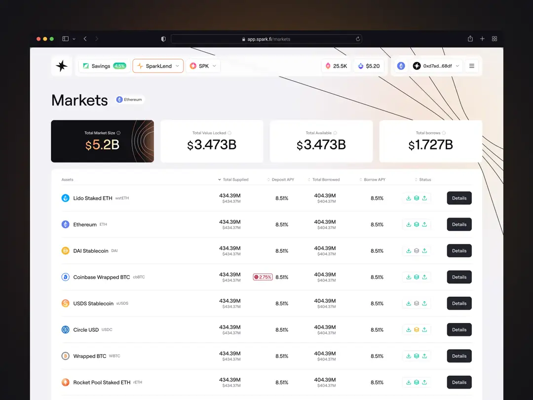
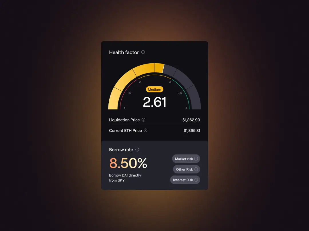
The airdrop flow was our entry point, but we designed Spark's entire product suite. SparkLend for borrowing and lending. Spark Savings for earning yields on stablecoins. Markets interface for managing positions across multiple assets. Points system rewarding ecosystem participation.
Every product faced the same fundamental challenge: make sophisticated DeFi mechanics work for both crypto natives and newcomers. A lending protocol needs to feel as reliable as a traditional bank to mainstream users, while still offering the advanced features that power users expect. This wasn't about creating a pretty interface for one campaign. It was about building the foundation for how thousands of users would interact with DeFi infrastructure handling billions in value.
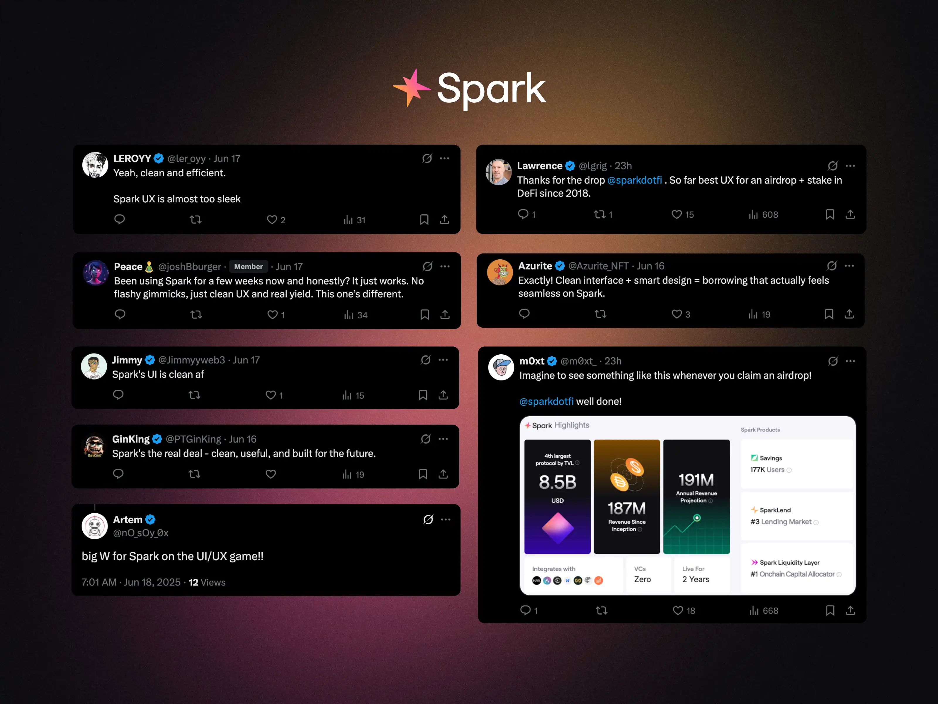
The numbers don't lie - but the feedback means even more
The community response told us we'd built something that actually worked.
We're proud not only of the numbers (94% staking rate) but especially of the user feedback. When users say that using Spark "just works" - that's when you know the design did its job.
You can explore the live application at app.spark.fi - the complete UI/UX experience is our work.