This ID lets you retrieve or verify your consent settings. It stays saved for {0} months or until you clear cookies — keep a copy in case you need to reference it.
AMC89MQ329407NSADRFA09MA7SD
Required
Essential Consent
Off
On
Marketing Consent
Off
On
Analytics Consent
Off
On
Personalization Consent
Properly uses cookies and similar technologies to improve your experience, analyze traffic, and to show you relevant content and advertising.
You can accept all, reject all, or customize your privacy settings.
There have always been discussions throughout the projects about where a redesign ends and a rebrand begins. In reality, the boundary is rarely clear. As a project evolves through countless iterations, reviews, and new ideas, a redesign can gradually become something entirely different.
That's why establishing clear principles became one of our first priorities. Before redesigning a single component, we first had to define what made Axi unique and which elements should remain consistent throughout the process.
This is a common challenge in large-scale rebrands. When too many familiar elements disappear at once, users no longer identify the brand they've trusted for years. Instead of experiencing evolution, they experience replacement.
Preserving Recognition
For more than 19 years, Axi had built a strong presence in multiple markets with a visual identity recognized by millions of traders worldwide. Our goal wasn't to replace that identity, but to evolve it. We wanted existing users to instantly know Axi while introducing a visual language that felt bolder, more premium, and future-ready.
To achieve this, we identified the core recognition assets that would remain consistent throughout the redesign.
Color, the signature red.
Logo, the brand's strongest visual identifier.
Typography, the familiar sans-serif foundation.
The cut element, a distinctive triangular shape used across the identity.
Everything else was open for discussion.
The Signature Red
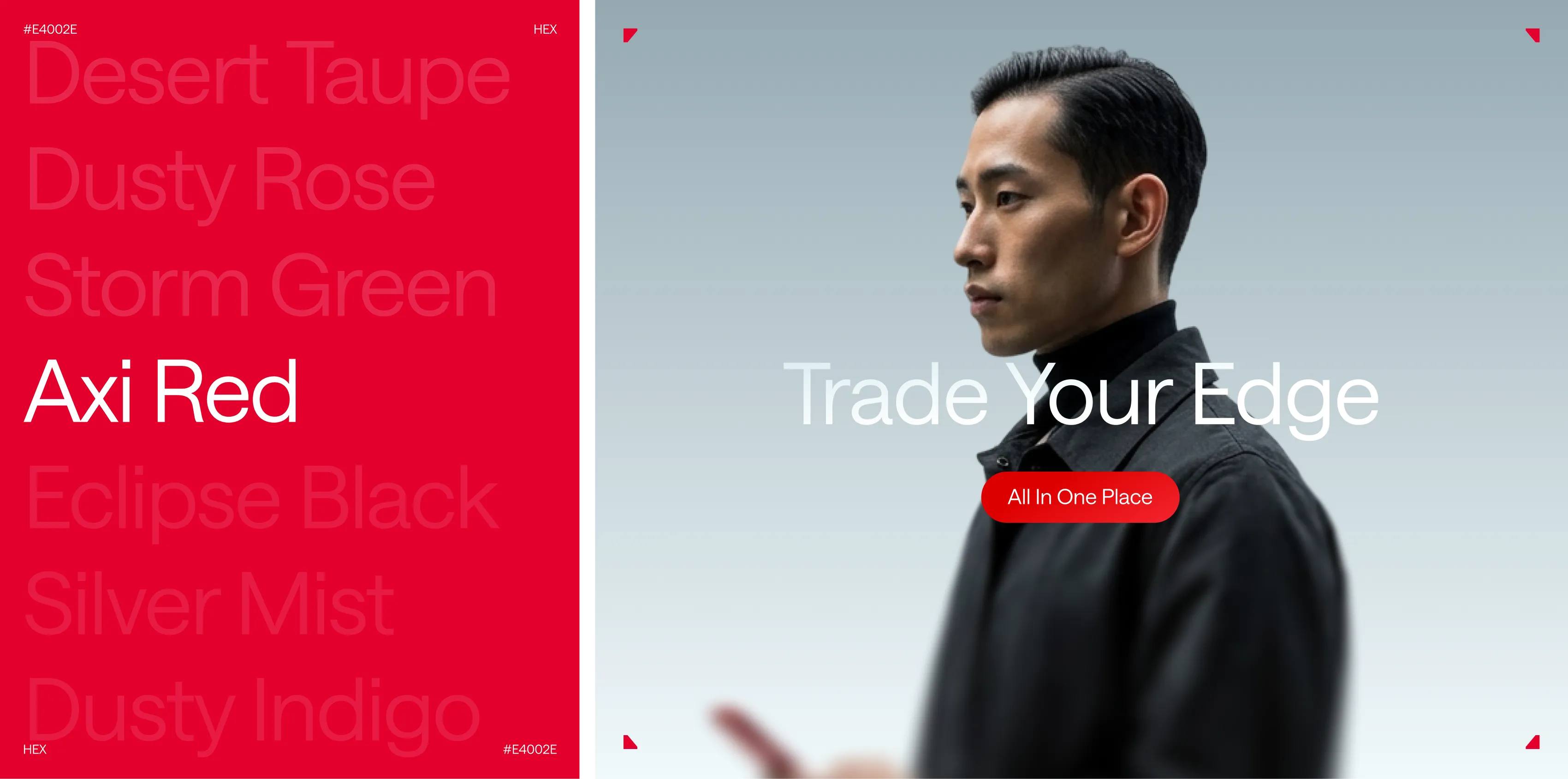
The signature red was one of the most valuable assets to preserve. At the same time, its original shade no longer matched the confidence of the new visual language.
In trading, red naturally signals losses and negative performance, making it a difficult color for primary actions. Instead of removing it, we had to find the right balance between brand recognition and usability.
We shifted the red toward a deeper burgundy tone, kept it away from key trading actions, and used it more selectively across secondary interactions, imagery, and UI details. This allowed the brand to stay unmistakably Axi without letting its strongest color interfere with the product experience.
The solution wasn't introducing a completely new color, it was refining the existing one.
The shift from #FF5253 to #E4002E seems almost invisible in isolation. Across the entire identity, however, it creates a noticeably stronger impression. The updated shade feels richer, bolder, and more premium while preserving the recognition the previous color had built over the years.
The Logo Upgrade
The logo became one of the most delicate parts of the redesign. Even the smallest adjustment could influence recognition, which meant every decision had to be intentional.
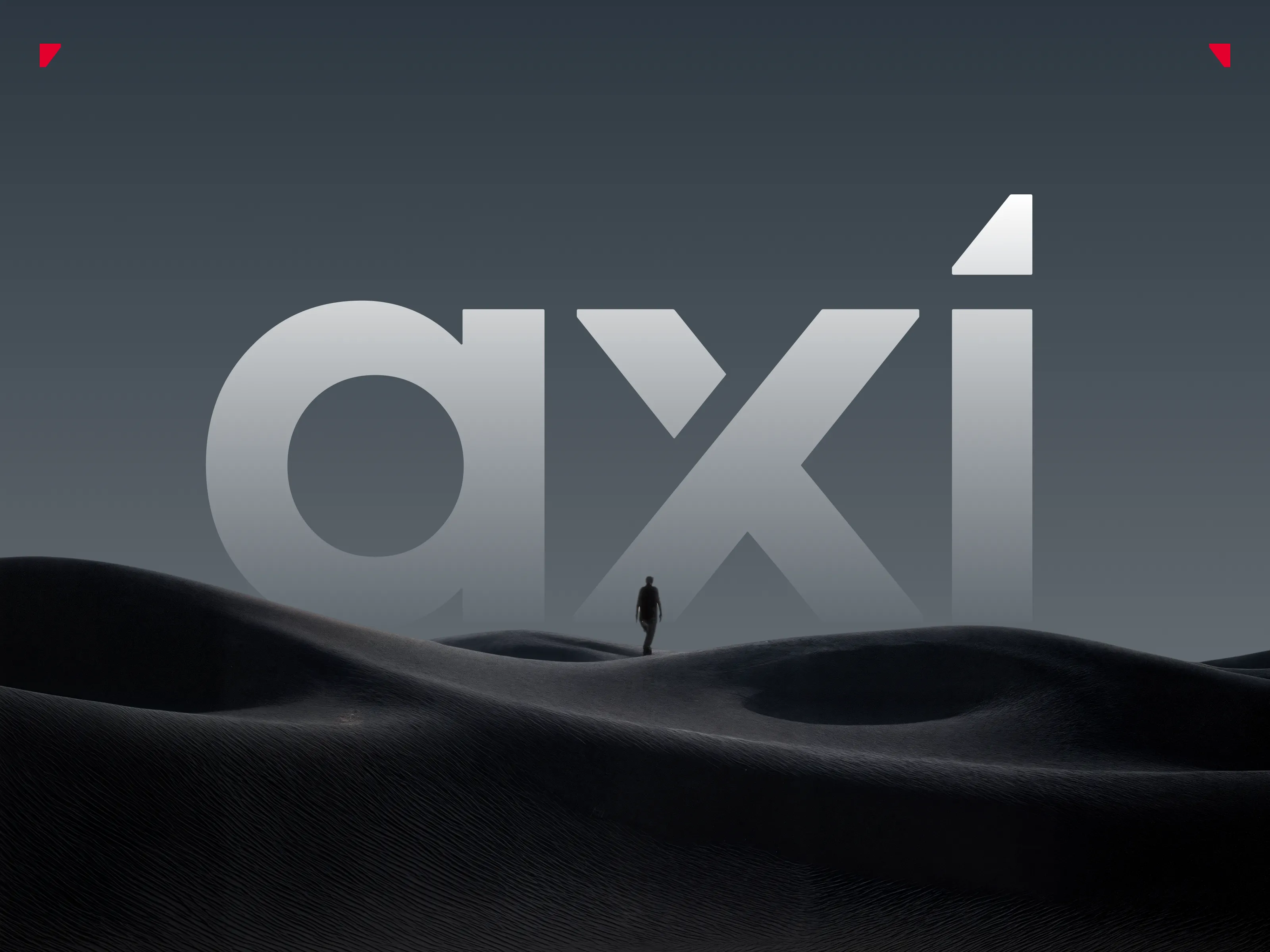
The previous version relied on rounded corners that no longer reflected the sharper visual language we were creating. Instead of redesigning the logo completely, we refined its existing geometry.
Corners became sharper, internal cuts became cleaner, and the overall construction better reflected the bold character of the new brand.
The refinements continued inside the letterforms. The counter of the “a” was adjusted, spacing between the “x” and “i” was improved, and the tittle of the “i” was rebuilt to better align with the geometry and perspective established by the “x”.
None of these changes were dramatic on their own. Together, however, they transformed the logo into a cleaner, more balanced, and more confident version of itself.
The redesigned tittle of the “i” also became much more than a logo detail.
It evolved into one of the key graphic elements of the identity system, appearing in patterns, illustrations, backgrounds, and interface components. By refining a single existing asset, we strengthened consistency across the entire brand instead of introducing another visual language.
The Evolution of the Cutting Shapes
The triangular cut already existed in Axi's previous branding. It appeared mostly as a simple angled line used to highlight information or introduce movement into layouts.
Rather than replacing it, we explored how far this idea could evolve.
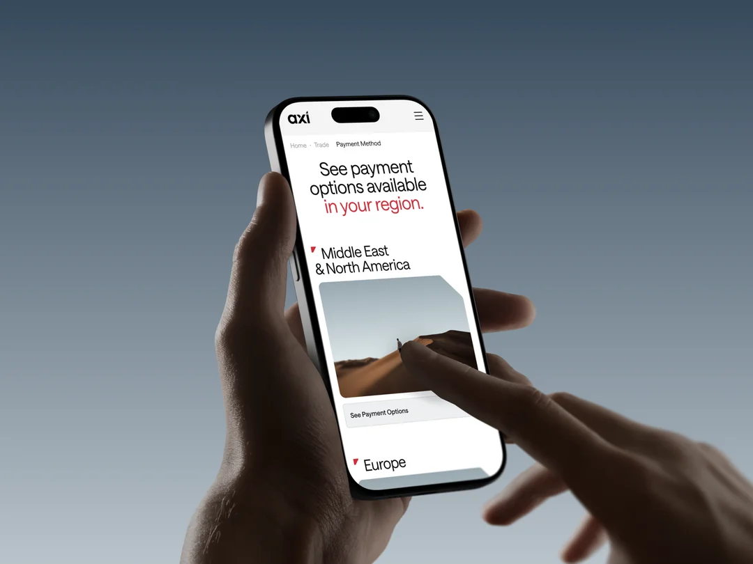
One of the strongest references came from the awards section, where the cut naturally framed content and created dynamic compositions. That became the starting point for developing a new container system used throughout the brand and especially on the website.
The original idea remained the same, but its role expanded significantly. Instead of being a decorative detail, the cut became one of the foundations of the new visual language.
Reflections
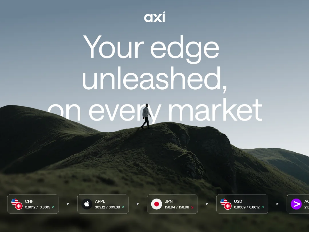
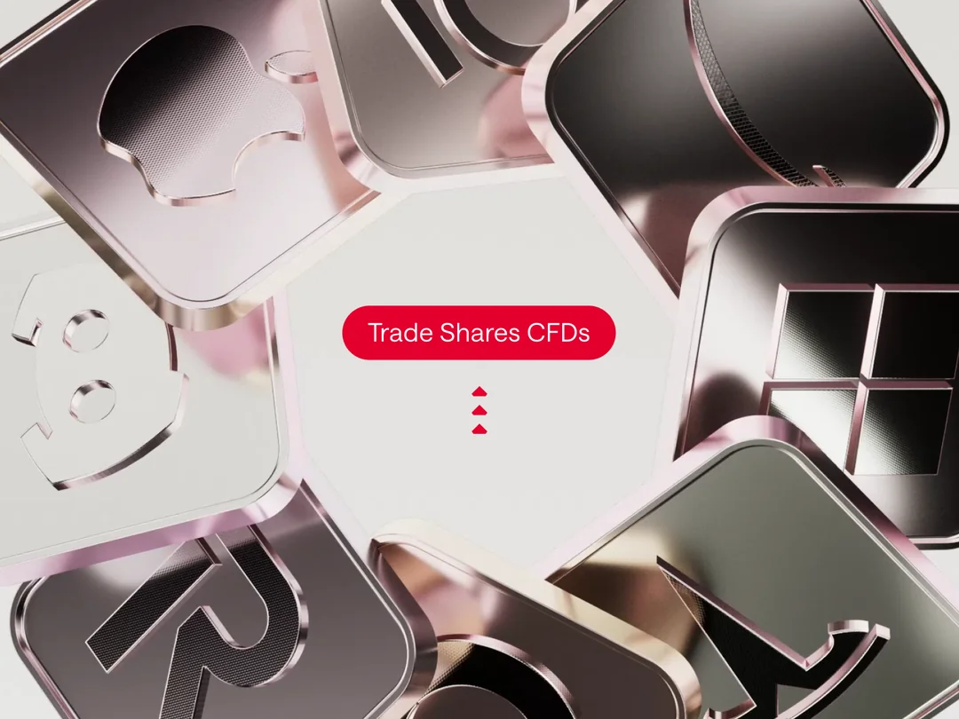
Looking back at the project, it's surprising how few original elements actually remained. The redesign introduced an entirely new world of AI-generated characters, custom landscapes, refreshed layouts, and a completely new visual system.
That was intentional.
Recognition isn't built by preserving everything. It's built by preserving the right things.
By identifying the few assets that truly defined Axi, we were able to redesign almost every other aspect of the brand without losing the connection users had built over the years, and achieve the expected result with a brand-new feeling.
The result is a visual identity that feels entirely new while remaining unmistakably Axi. Existing users don't feel like they're looking at a different company, they simply feel like the brand they've always known has evolved.