This ID lets you retrieve or verify your consent settings. It stays saved for {0} months or until you clear cookies — keep a copy in case you need to reference it.
AMC89MQ329407NSADRFA09MA7SD
Required
Essential Consent
Off
On
Marketing Consent
Off
On
Analytics Consent
Off
On
Personalization Consent
Properly uses cookies and similar technologies to improve your experience, analyze traffic, and to show you relevant content and advertising.
You can accept all, reject all, or customize your privacy settings.
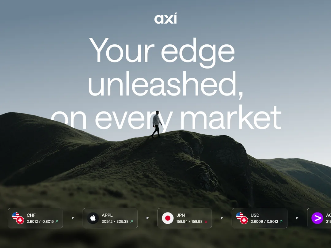
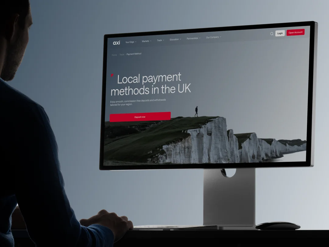
Meet the challenges we faced while designing the new website for Axi, a global online broker with operations across 100+ countries. Across its international operations, Axi offers a range of trading products and services through regulated entities in multiple jurisdictions, including Australia, the United Kingdom, Cyprus, the United Arab Emirates, and New Zealand. Products and services may vary by jurisdiction.
Challenge 0: Selling the Concept
Because of Axi’s business model, a trading platform operating across multiple international markets, the website needed to solve several complex product and business challenges simultaneously. What did all our stakeholders expect from us?
First, it had to be highly scalable across multiple jurisdictions and language versions, each with different regulatory requirements, product offerings, and audience segments. The platform serves diverse user groups, meaning that a one-size-fits-all approach was never an option.
Second, the website needed to communicate the product effectively despite the fact that the trading application itself was undergoing a major redesign in parallel. In many ways, the website had to become the bridge between the current product experience and the future vision of the App.
The challenge extended beyond product communication. We needed to balance two seemingly opposite brand attributes: corporate trustworthiness and aspirational ambition. Users needed to feel that Axi was both reliable enough to trust with their investments and modern enough to inspire confidence in their financial trading experience.
Additionally, due to a tight timeline and the involvement of client’s development team, the solution had to remain technically pragmatic. Excessive animations and highly custom interactions were intentionally avoided in favor of implementation efficiency and maintainability.
In this article we’ll focus on the design challenges that emerged during execution.
Challenge 1: Managing a Design Process Across Two Organizations
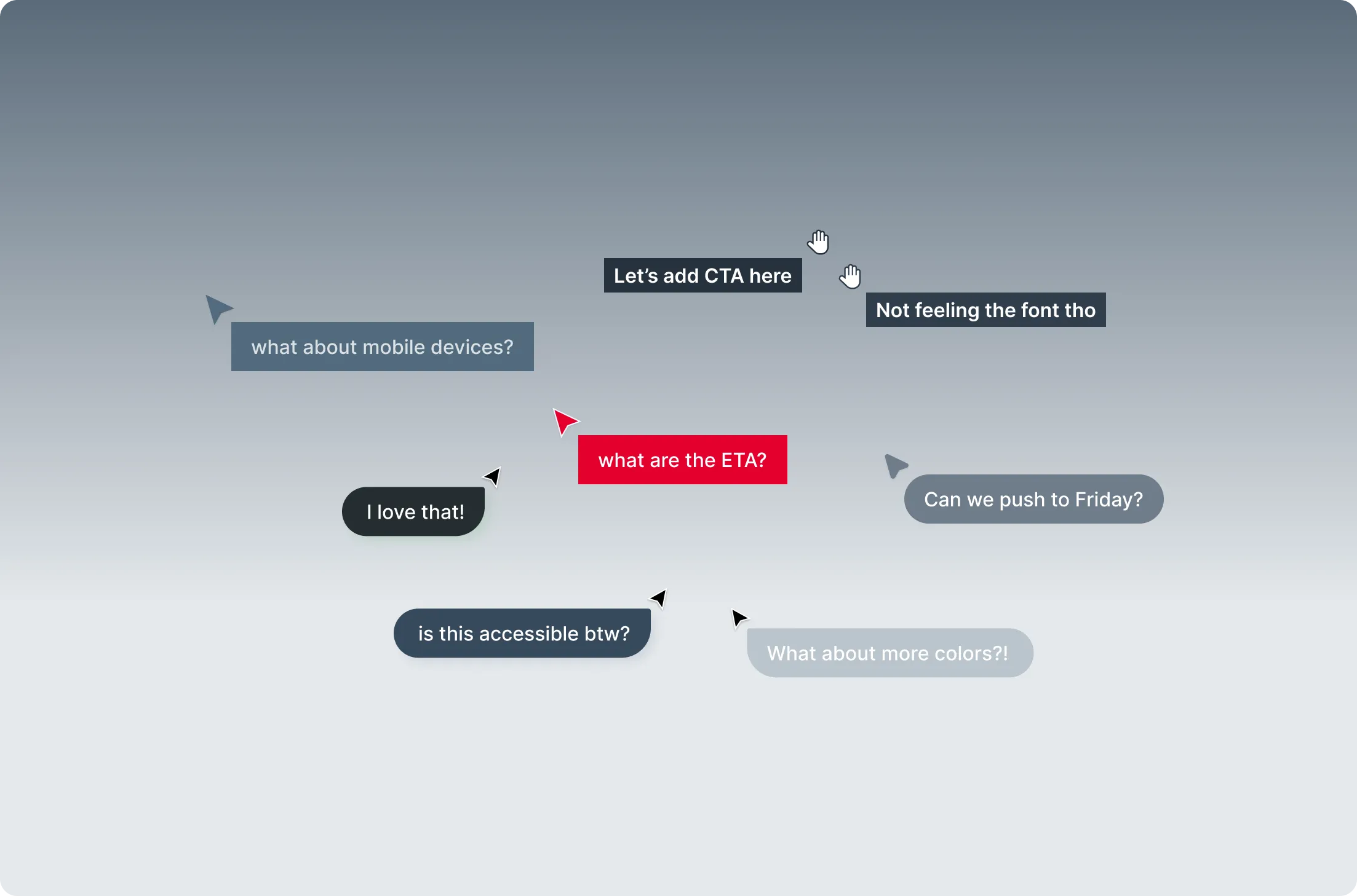
One of the biggest challenges turned out not to be visual design, but collaboration.
With approximately twenty stakeholders involved the way we structured communication became a critical success factor for the project.
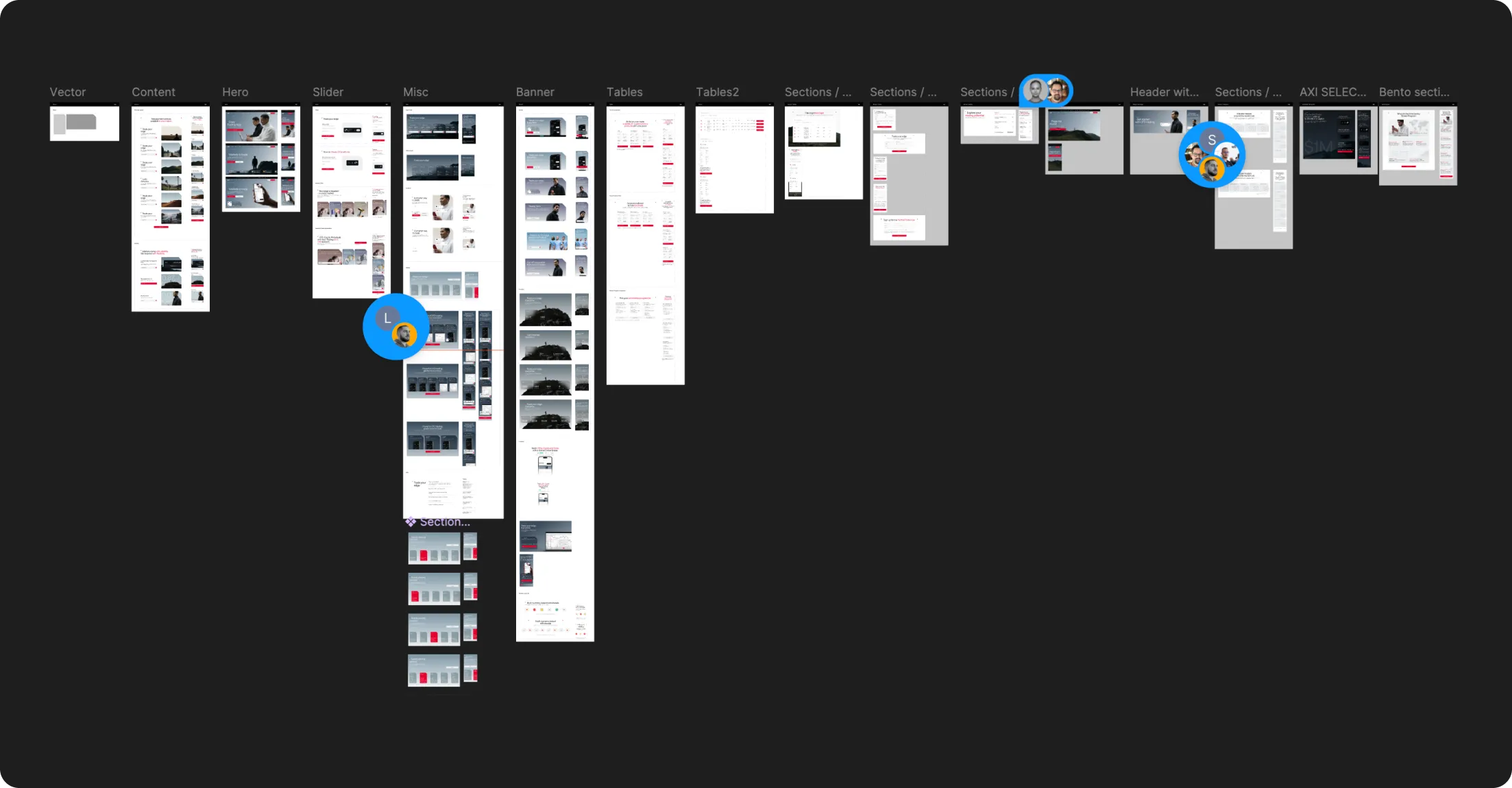
We've had to partly turn into project managers, which from our perspective is now one of the key skills a designer needs to develop to keep up with a changing market. We're not just orchestrating classic tools and new AI-related ones, we also need to navigate the process nimbly, talking to both developers and people from marketing departments. In this case, organizing files, but also frequent updates and staying in constant touch with the client, gave us an edge that AI alone doesn't have. We've built a really efficient machine that ships.
Challenge 2: “Working Is Better Than Perfect”, Designing Within CMS Constraints
One of the most valuable lessons from this project was learning where design excellence meets implementation reality.
Because of the accelerated timeline and client-side development process, we had to work within the limitations of an existing CMS architecture. This meant certain content structures and page layouts could not be fundamentally altered without creating substantial development overhead.
As a result, some sections evolved differently than originally envisioned during the concept phase. Instead of pursuing visual perfection, we prioritized scalability, maintainability, and implementation feasibility.
In practice, this meant modernizing many sections while preserving their underlying architecture.
The project reinforced a principle that product designers learn repeatedly:
A functioning, scalable solution creates more value than a perfect design that never reaches production.
Challenge 3: When Branding Meets Product Reality
Before working on Axi, I believed translating a brand into a product experience was relatively straightforward. This project proved otherwise.
CTA Strategy in a Trading Environment
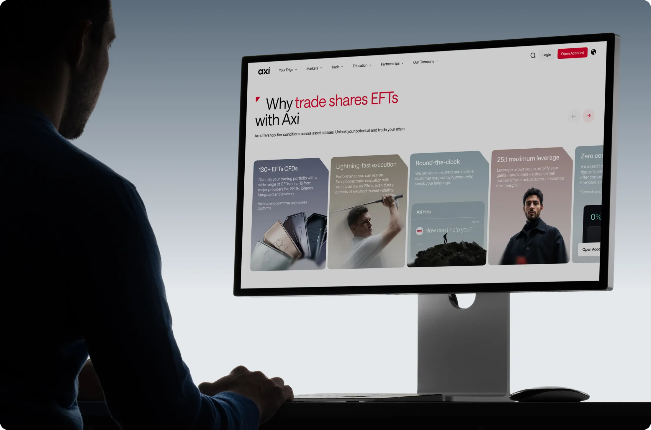
Axi’s website is ultimately a conversion-focused product. Its primary objective is to encourage users to create accounts and download the trading platform.
The challenge emerged from an unusual branding decision: red was the primary brand color.
In financial products, red is traditionally associated with losses, declining markets, and negative performance indicators. Using it as a dominant brand color created immediate UX challenges around action hierarchy and conversion psychology.
How do you design primary, secondary, and tertiary CTAs while avoiding subconscious associations with "Sell" actions or negative market outcomes?
Several decisions helped solve the problem:
The brand red was intentionally shifted toward a deeper pink-burgundy spectrum rather than a traditional trading red.
Red was excluded from primary product actions inside the trading experience.
Persistent primary CTAs were surfaced through navigation patterns rather than relying solely on color.
Additional tertiary interaction points incorporated red strategically throughout the experience.
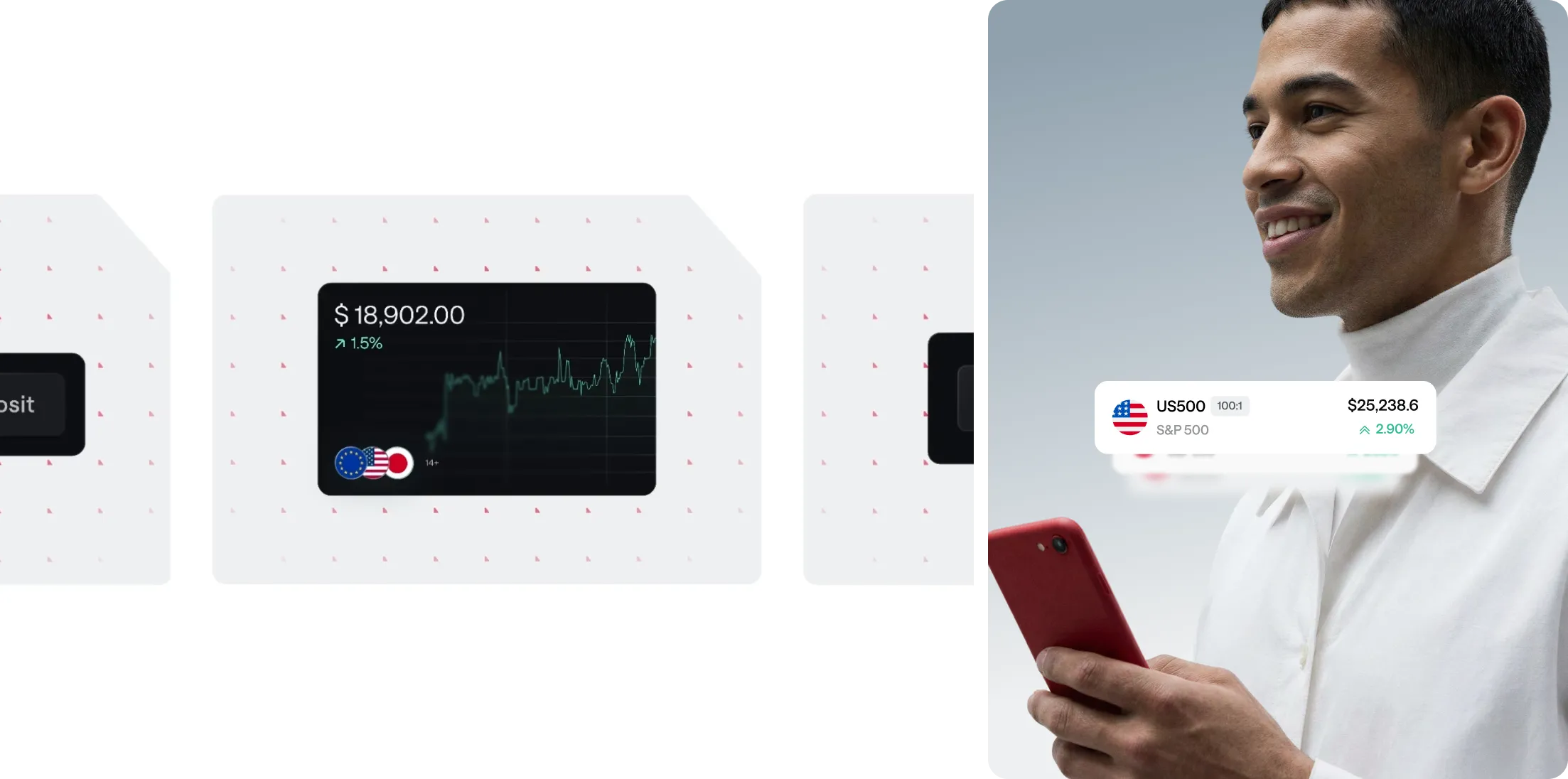
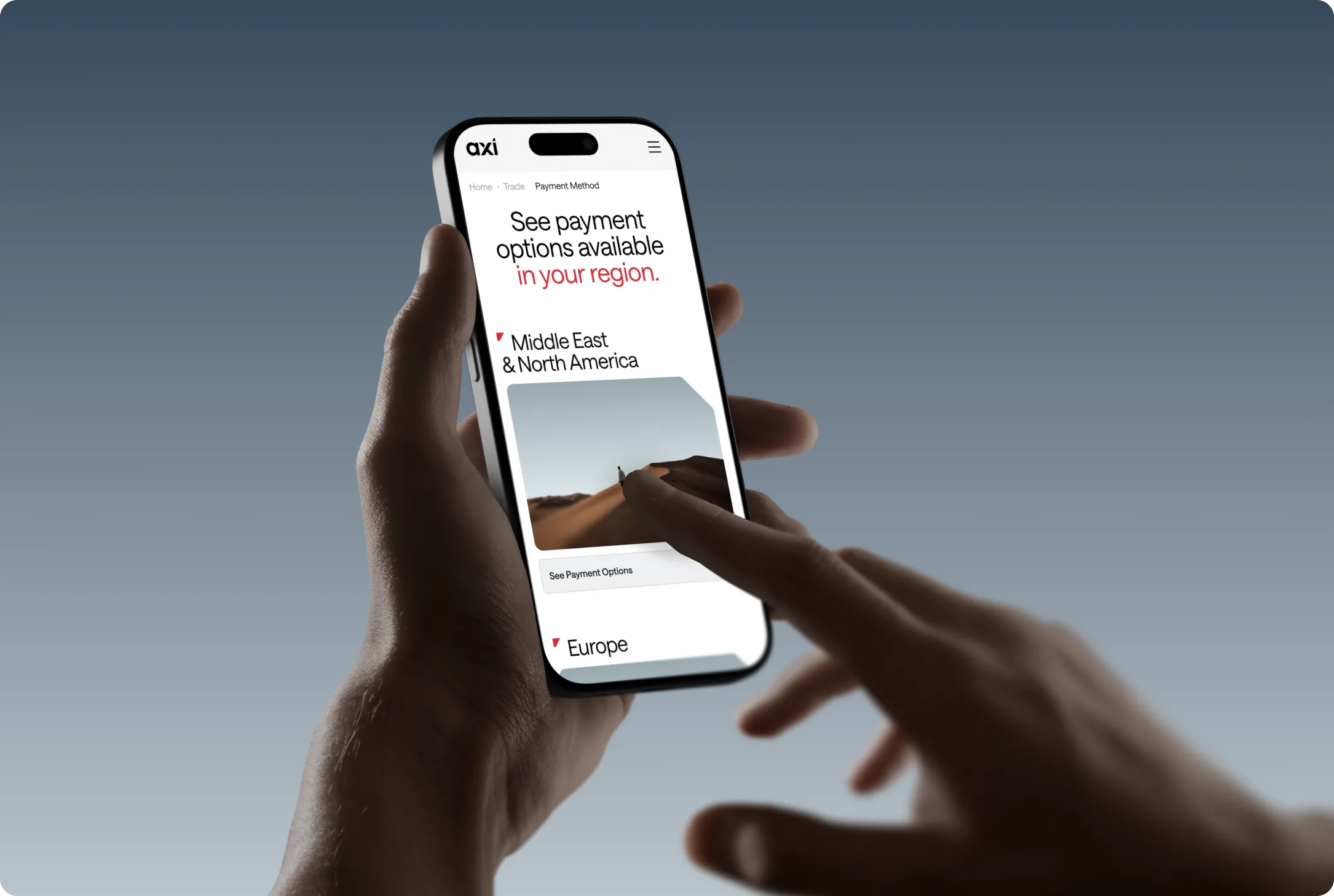
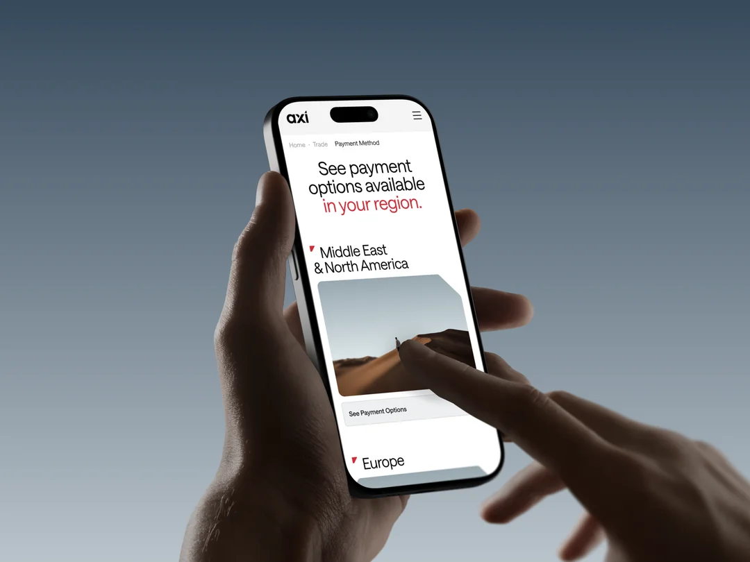
Product imagery, devices, and UI assets introduced controlled red accents to reinforce brand recognition without compromising usability.
The result was a balance between conversion optimization and brand consistency.
Responsive Design and Gradient-Based Branding
The original brand proposal relied heavily on sophisticated gradients.
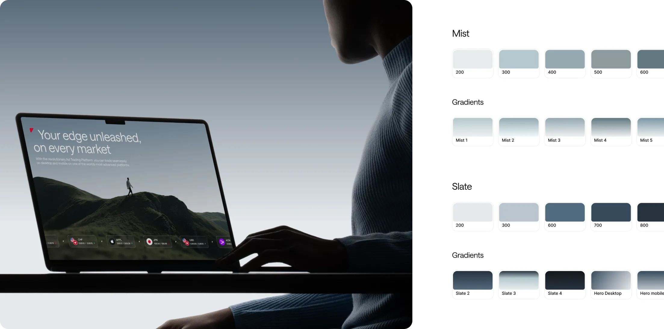
While visually impressive, these gradients introduced challenges once real content, localization, and responsive layouts entered the picture. During implementation we discovered that some gradients negatively impacted readability, accessibility, and responsive behavior, and using them could have significantly lowered conversion.
To address this we introduced stronger contrast ratios, dedicated gradient swatches for desktop and mobile, and optimized gradient direction for each breakpoint. All of this in order to align visual needs with business ones and improve both conversion and system scalability.
Signature Component Cut-Outs vs Responsiveness
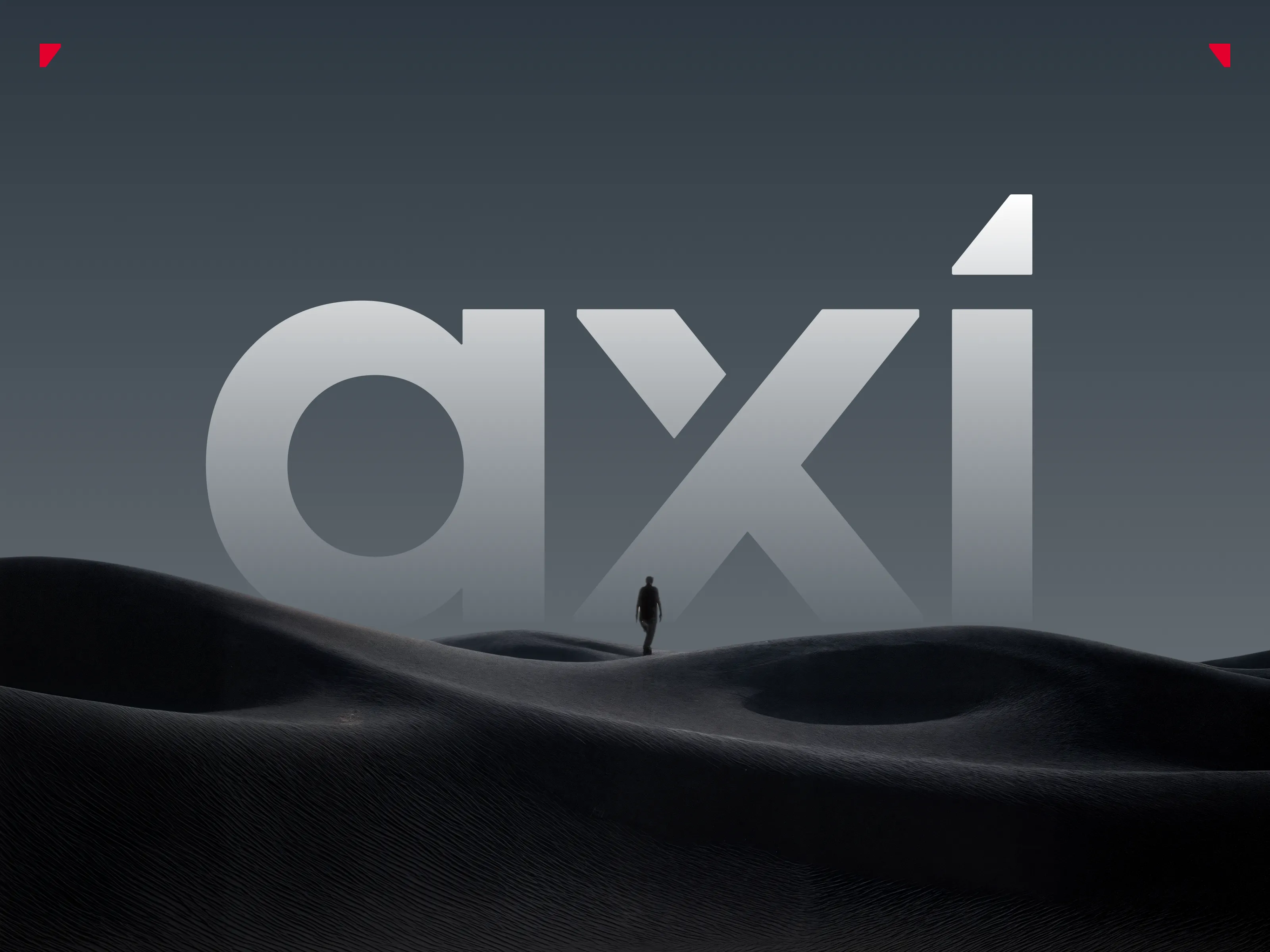
One of the most recognizable elements of the Axi visual identity was a distinctive angled cut-out used throughout components and typography layouts.
The challenge was maintaining visual consistency while ensuring responsive scalability.
Instead of recreating the shape manually across dozens of components, we developed a reusable vector-based solution available in both horizontal and vertical formats. These assets could then be applied as fills within Auto Layout structures, ensuring consistency regardless of component size.
The solution transformed a branding element into a scalable design system pattern.
Building a Website Design System Like a Product
Given the scale of the website, the number of jurisdictions, and the volume of pages involved, creating a robust design system became essential.
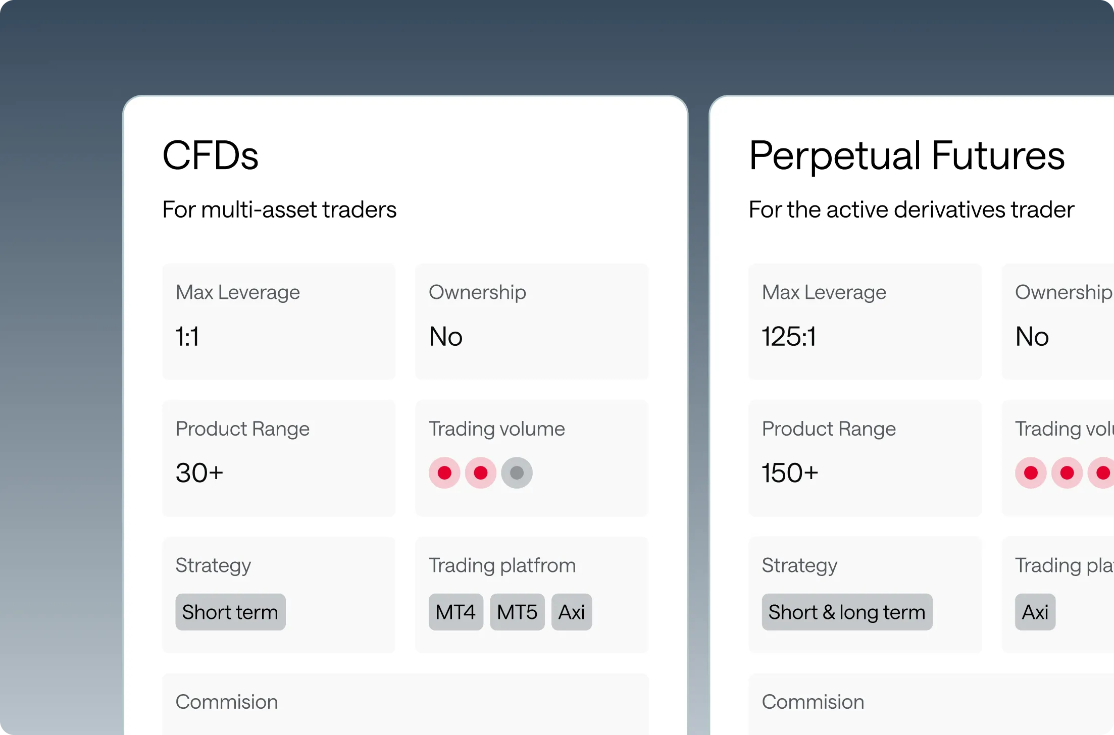
Beyond traditional UI foundations such as buttons, navigation patterns, and jurisdiction-specific footers, we introduced a section-based component architecture.
The process followed several steps:
Analyze recurring content patterns across the entire website.
Identify common section structures.
Create reusable section templates.
Build these templates using existing atomic design system components.
This transformed website creation into a modular assembly process rather than a page-by-page design exercise.
The benefits extended beyond the design team.
Developers were able to implement a manageable set of reusable section types instead of handling hundreds of unique layouts, significantly improving development efficiency and long-term maintainability. This approach sped up the whole process for all stakeholders involved.
Reflections
This project changed the way I think about design.
I no longer see design purely as visual execution. Nor do I define it solely through usability, accessibility, or intuitive interactions.
The most challenging layer sits somewhere deeper: aligning the needs, goals, and constraints of every stakeholder involved in creating a product.
Design becomes a process of reconciliation, between business objectives and user needs, branding and functionality, technical constraints and creative ambition.
What we ultimately built for Axi supports both the business and its users. It's more than a visual expression of the brand, it's a functional representation of the organization itself.