This ID lets you retrieve or verify your consent settings. It stays saved for {0} months or until you clear cookies — keep a copy in case you need to reference it.
AMC89MQ329407NSADRFA09MA7SD
Required
Essential Consent
Off
On
Marketing Consent
Off
On
Analytics Consent
Off
On
Personalization Consent
Properly uses cookies and similar technologies to improve your experience, analyze traffic, and to show you relevant content and advertising.
You can accept all, reject all, or customize your privacy settings.
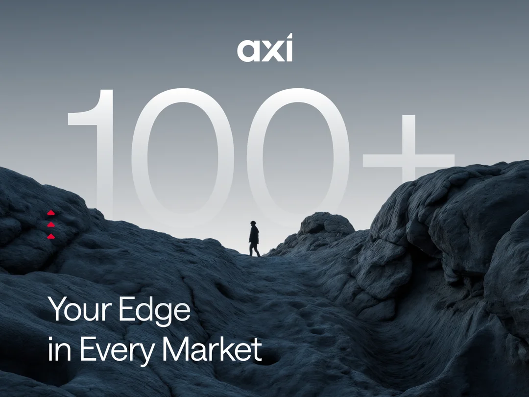
More than 100 countries. Tens of thousands of active trading accounts. Over $5 trillion traded every year.
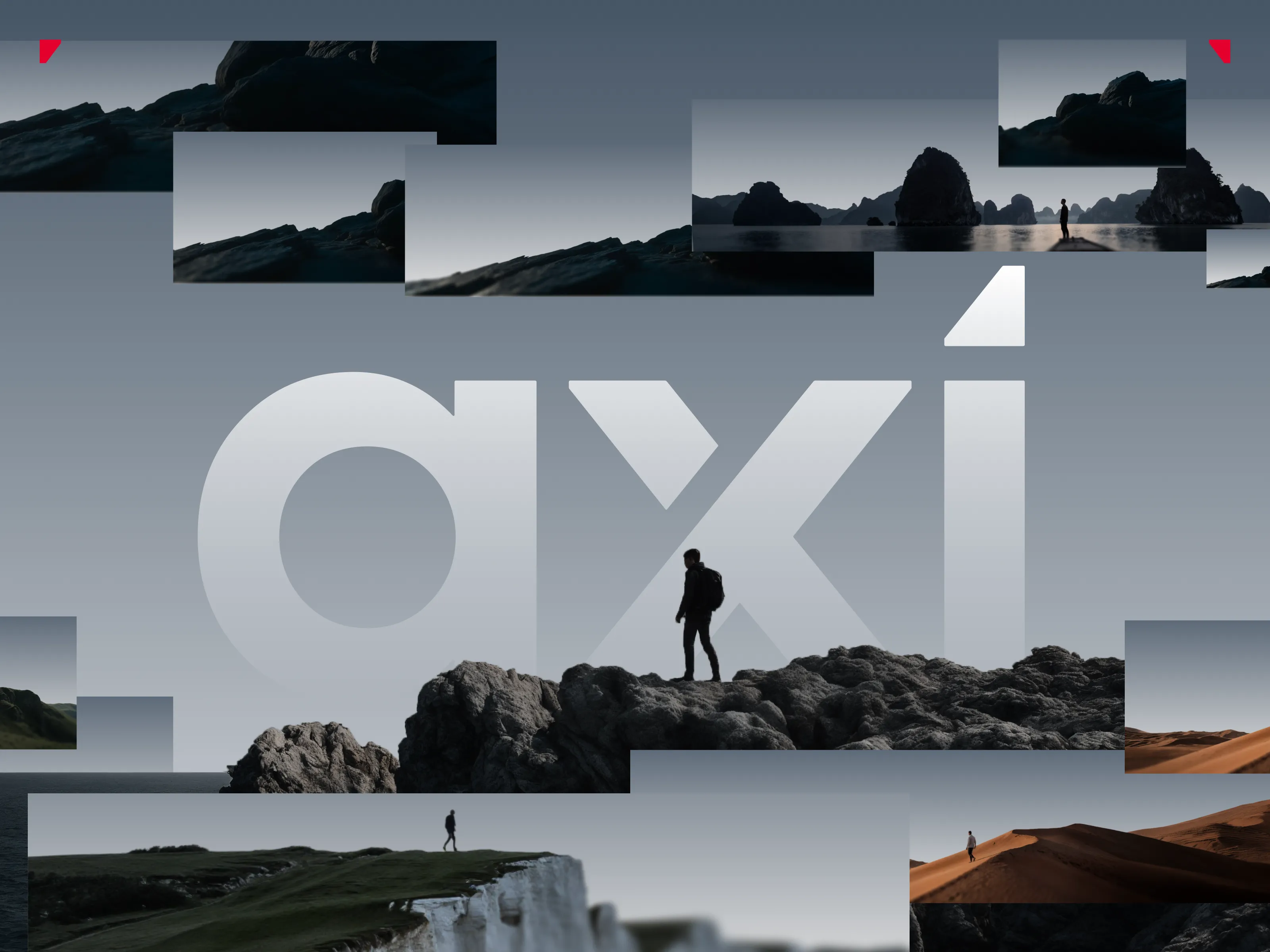
That's the scale we were rebranding. Not a start-up, not a typical scale-up, but a company where every brand decision plays out across the entire world at once.
And the bigger the scale, the bigger the challenge. At Axi's level, the water was deep enough that without the right structure, it would have been easy to drown.
Why Axi's Global Branding Needed to Change
Axi has been operating for more than 19 years, and with that comes a tremendous responsibility towards both long-standing and new clients who have come to trust the brand over the years. Yet in a world where time no longer moves but races forward, even a brief moment of stagnation can leave a company far behind. That is exactly what happened to Axi's branding.
The abundance of conflicting visual elements, colors, 3D assets, and AI-generated content created without a cohesive system felt overwhelming, distracting, and, most importantly, failed to inspire confidence in new customers.
Everything felt as though it belonged to a different story, yet somehow existed within the same ecosystem. Users from every corner of the world were presented with the exact same experience, one that offered little they could personally relate to.
In 2026, branding is no longer an accessory. It is one of the key factors that determines whether a company is perceived as trustworthy and professional, or as something users should avoid. And if trust matters anywhere, it matters most in trading, where tens of thousands of people entrust a platform every single day.
That was the problem. A problem that wasn't generating new leads, and one that quickly became one of the central objectives of the rebrand.
"We need this brand to be local… even when it's global."
We took that statement seriously.
Because we understand it ourselves. Isn't it easier to connect with people who feel familiar? Don't we all feel more comfortable in environments that reflect our own culture, surroundings, and experiences?
Axi has presence in more than 100 countries. Naturally, designing a completely unique experience for each individual market would have been impossible. What we could do, however, was divide the world into regions. And that's exactly what we did.
Localizing One Brand Across Four Regions
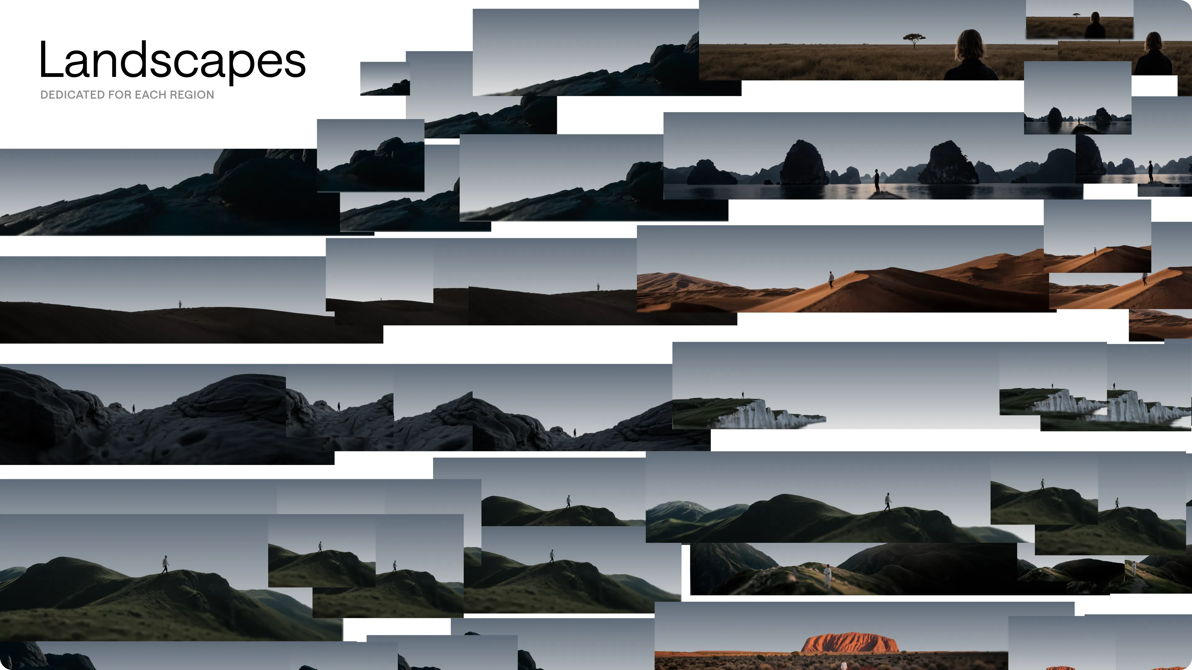
After analyzing all of Axi's markets, we grouped them into four core regions: Europe, Asia, the Middle East and South America. The split wasn't arbitrary, each region shares enough cultural and visual context to be spoken to as one, without flattening what makes its markets distinct.
For each, we studied the landscapes that define it and gathered extensive visual references of its environments:
Europe: diverse landscapes featuring plains, rolling hills, mountain ranges, and dense deciduous and coniferous forests.
Asia: from the world's highest mountain ranges to vast deserts and agricultural lands, spanning environments from tundra to tropical rainforests.
Middle East: dominated by deserts, dry plateaus, and mountain ranges, characterized by sparse desert vegetation.
South America: expansive coastlines, mountain ranges, tropical rainforests, and open plains.
Designing Personas for Local Audiences
The next step was to collect ethnic portrait references representative of each region. Using the latest and most advanced AI tools available, we then created a series of personas that would become the heart of the brand.
Each region was represented by characters of its own, reflecting the people and cultures of that part of the world. The goal was simple: create characters that local audiences could naturally identify with. But we didn't stop there. We even researched the most common names associated with each region and assigned them to our personas.
As a result, the local dimension of the brand emerged with a level of authenticity that Axi users had never experienced before.
For the first time, users could feel that the brand understood them, acknowledged their local context, and cared about creating an experience that felt familiar and relevant.
Rather than ignoring cultural differences, Axi embraced them and transformed them into one of the brand's strongest assets. Because a global brand doesn't have to feel anonymous.
More Than a Face and a Place
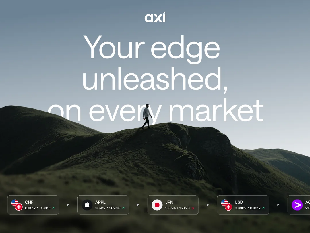
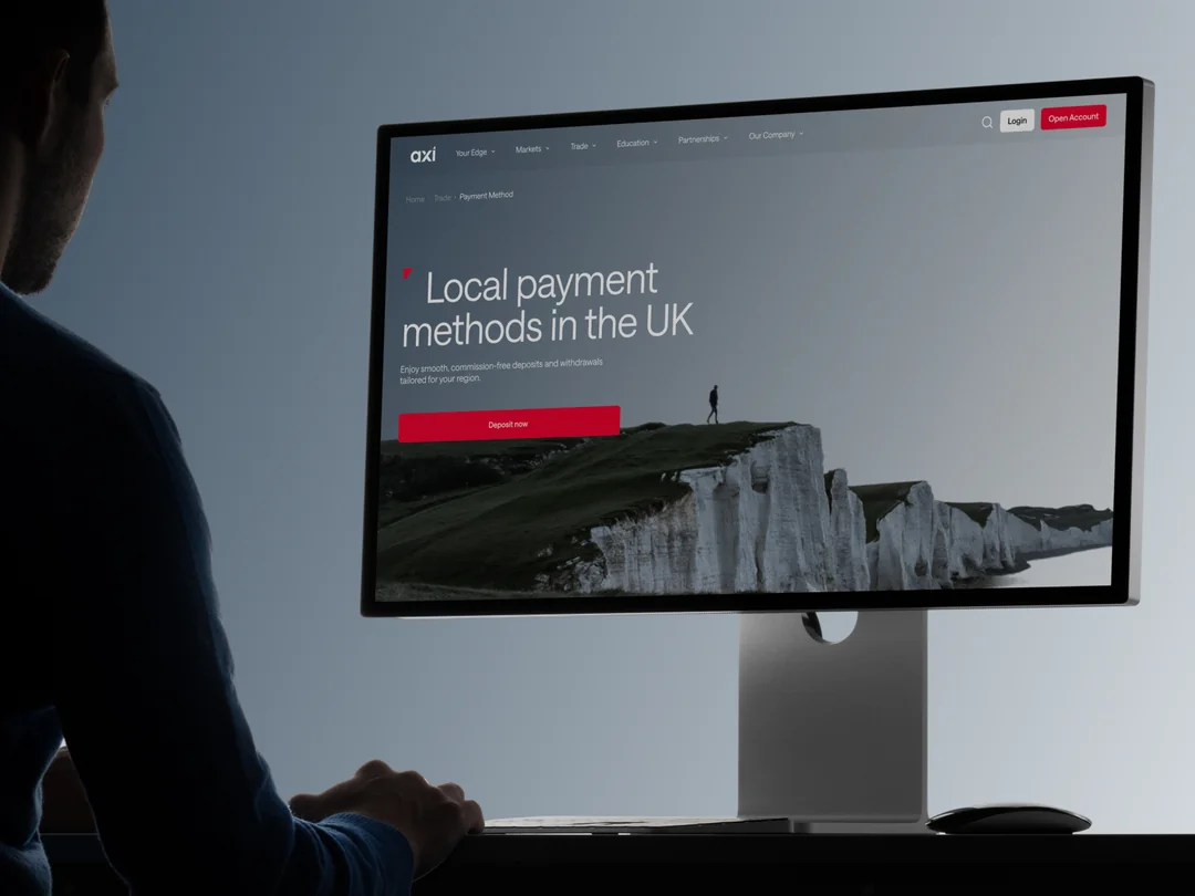
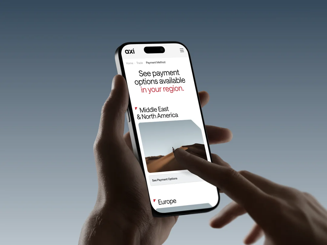
Regions gave us personas and landscapes, but a brand this size has to hold up in the details too. Because Axi operates under different rules in different jurisdictions, we built the visual system so its regional elements could be swapped without breaking anything: a persona from Europe can give way to one from Asia, a landscape can change, and market-specific pieces like maps or help screens can show the right capitals and languages, all inside the same brand.
Typography did its share of the work, and it took more than one typeface to do it. Alongside Axi Sans, the system carries whole Noto Sans families picked for specific languages, so a reader in any region sees the brand set in their own alphabet rather than a Latin approximation of it.
{{case-study}}
The result is a brand that doesn't only look local in its faces. It behaves locally, down to the alphabet.
And the idea worked faster than we expected. Two weeks after launch, Axi came back asking for more models, more local still, representing individual countries rather than whole continents.
That request is the real result. A system proves itself the moment a client starts asking it for things nobody planned for, and Axi was asking almost immediately.