This ID lets you retrieve or verify your consent settings. It stays saved for {0} months or until you clear cookies — keep a copy in case you need to reference it.
AMC89MQ329407NSADRFA09MA7SD
Required
Essential Consent
Off
On
Marketing Consent
Off
On
Analytics Consent
Off
On
Personalization Consent
Properly uses cookies and similar technologies to improve your experience, analyze traffic, and to show you relevant content and advertising.
You can accept all, reject all, or customize your privacy settings.
Most companies don't think much about their internal tools until they become a problem.
And by then? It’s already too late. Teams spend hours on tasks that should take way less time. They memorize workarounds that someone has to explain to every new hire. They click through a few different screens just to finish one simple thing.
And here's what happens next: you're moving fast, shipping features, solving problems. You add one more section. Then another view. Then a filter that makes sense for this one edge case. Each decision makes sense at the time.
Until one day you look up and realize your team is fighting the system instead of using it. This is how we ended up working with Optio Incentives on their backoffice redesign - and what we both learned about tools that "work" but don't actually work well in the long run.
When "it works" isn't enough
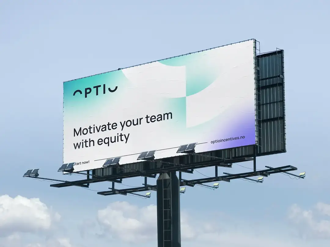
Optio is a Norwegian fintech company that helps organizations manage equity compensation and ownership structures. Complex, high-stakes work is mostly handled by their Customer Success team through an internal backoffice system. The system worked. But Optio's team knew it could work better.
When they decided to migrate their backoffice to a new platform, both sides - Optio's process owners and our team at Properly - saw the same opportunity: instead of simply moving the old structure to new technology, we could rethink the entire experience.
Understanding how people really work
We didn't start with wireframes or feature lists. We started by talking with people. Through workshops and one-on-one sessions with Optio's Customer Success team, we watched how they actually worked. Not how the system was designed to be used, but how real people navigated it under real pressure.
We ran a UX audit in parallel - examining information architecture, flow efficiency, cognitive load. The technical side. But the breakthrough came from understanding the human side: what information people needed at specific moments, where their attention went, where friction lived.
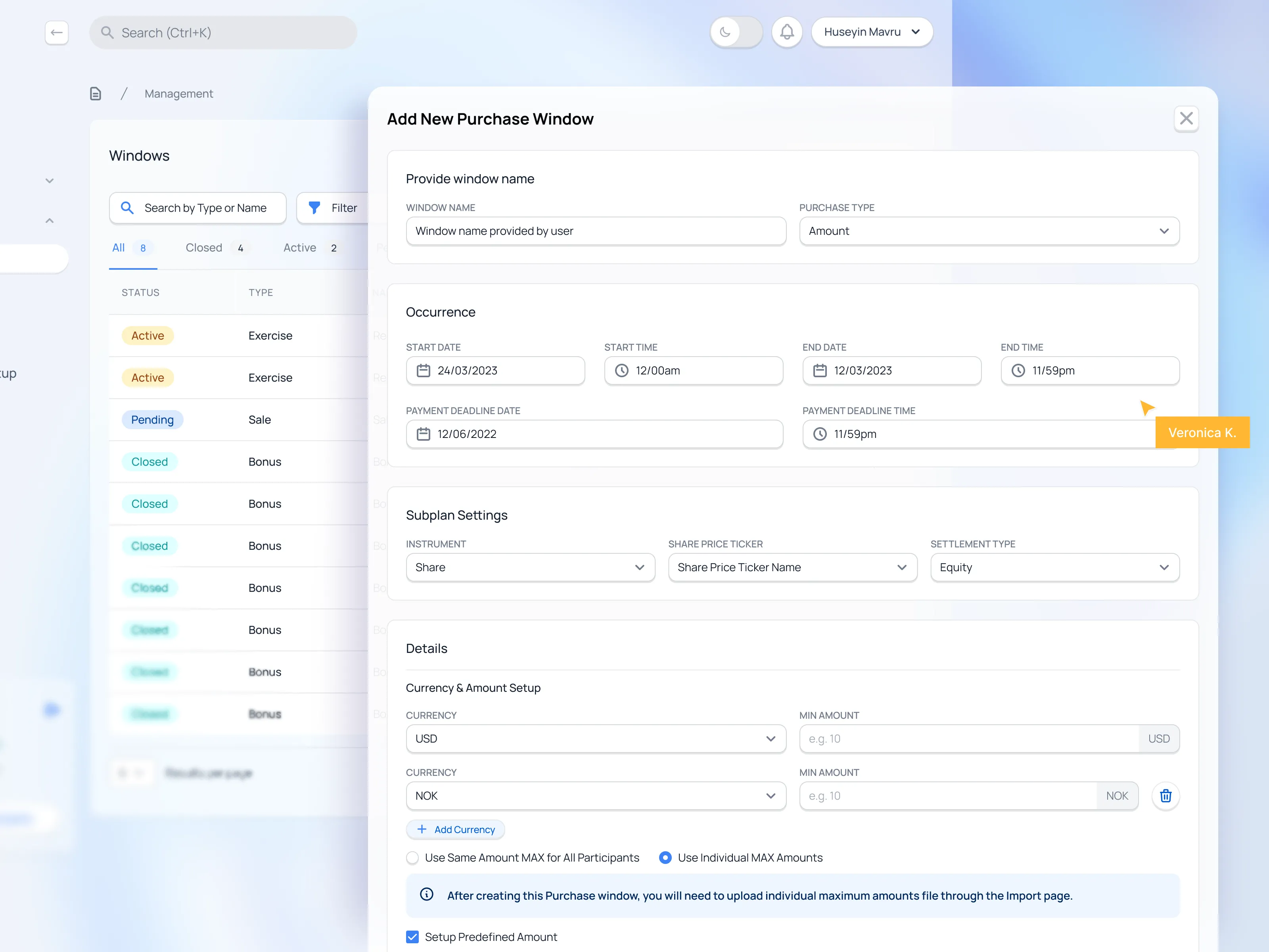
Here's what made it complex: every client's process was different. Some needed discount calculations, others reverse discounts. The backoffice had to handle dozens of configuration variations based on real client needs, but the interface treated everything the same way, forcing the team to mentally map each case every single time.
The pattern became clear: their backoffice was organized around data structures, not around the people using it. And that's where all the lost time was hiding.
Paulina and the Properly UX team really set the standard for what great product design should look like. Through workshops, prototyping, and user testing, they helped us refine ideas into clear user flows and reduced uncertainty for our developers, resulting in solid UX outcomes for our users.
Eirik Kalkvik Stenberg | Head of Financial Reporting @ Optio
Designing for the person, not the database
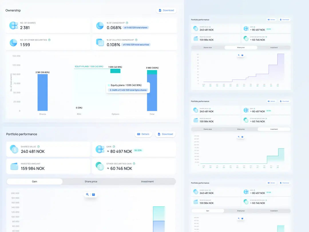
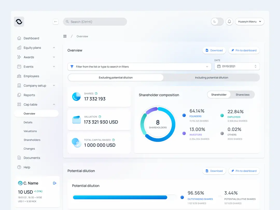
Armed with these insights, we rebuilt the experience around how people actually work. We reorganized information architecture so related elements lived together. Data that was scattered across multiple sections and pages now existed in logical, intuitive groups.
Instead of forcing people to move between multiple screens, we brought everything they needed into one cohesive view. Tasks that used to require manual repetition now happen automatically, freeing the team to focus on what actually matters. The new structure makes information feel effortless to navigate - you can instantly see what’s relevant, instead of searching for it.
None of these changes were revolutionary on their own. But together? They transformed a fragmented tool into a coherent workspace where people could focus on their actual work.
The result: 48.85% reduction in operational work
According to Optio's reports, the average time per process dropped by 48.85%.
Almost half the time previously spent on repetitive tasks was freed up for work that actually moves the business forward.
Every company is different, but the pattern holds: better UX directly translates into better efficiency.
What we learned from working with Optio
Most companies treat internal UX as an afterthought. Something functional is good enough. Nobody minds if it's a bit rough or incomplete. After all, these aren't customer-facing products - they're just tools for getting work done.
But here's what matters:
Your Customer Support and admin teams are users too. Their work is critical to your business, and they deserve tools designed with the same care you give to your customers.
Early investment pays off exponentially. The sooner you address backoffice UX, the more time and money you save in the long run. Every day of inefficiency compounds.
Collaboration makes the difference. What made this transformation work wasn't just good design - it was working closely with Optio's internal users, decision-makers, and developers. Continuous feedback helped us align every change with real business needs and technical feasibility. This partnership approach is why the redesign was actually adopted, not just delivered.
For enterprise fintech companies especially, where internal operations are complex and high-stakes, internal UX isn't a nice-to-have. It's a competitive edge hiding in plain sight.
{{case-study}}
Want to talk about your internal tools?
If your team has workarounds they've memorized, if processes take longer than they should, if "that's just how we do it" has become an accepted answer...
There's probably efficiency waiting to be unlocked.